
Content is one of the primary forces driving an inbound marketing strategy, and SEO in an integral part of making that work. Generally, this will cover the basics of on-page SEO: article structure, keyword placement, meta tags, title tags, alt text, headings, structured data, and use of formatting to create informally structured data in lists and tables.
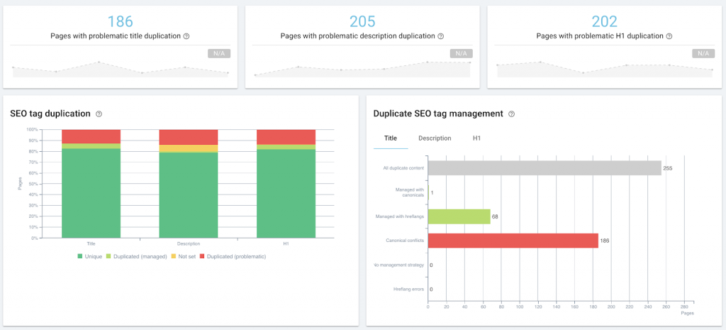
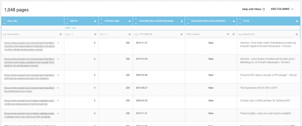
Auditing on-page SEO as part of content management, using Oncrawl.
This falls under the umbrella of technical SEO when you start to mass-optimize or monitor, whether through site audits or regular crawls, through machine generated natural language meta descriptions, snippet control tags, or structured data injection.
However, the intersection of technical SEO and content marketing is even greater where content performance is concerned: we look at the same primary data, such as page rank on the SERPs, or number of clicks, impressions, and sessions. We might implement the same sorts of solutions, or use the same tools.
What is content performance?
Content performance is the measurable result of how the audience interacts with the content. If content is driving inbound traffic, then measures of that traffic reflect how well or how poorly that content is doing its job. Every content strategy should, based on concrete objectives, define its particular KPIs. Most will include the following metrics:
- How visible the content is in search (impressions in SERPs)
- How pertinent search engines think the content is (ranking on SERPs)
- How pertinent searchers think the search listing of the content is (clicks from SERPs)
- How many people view the content (visits or sessions in an analytics solution)
- How many people interact with the content in a way that furthers business goals (conversion tracking)
So far so good.
The difficulty is in placing the cursor: what numbers mean that you have good content performance? What is normal? And how do you know when something is not doing well?
Below, I’ll share my experiment to build a “proof of concept” of a low-tech tool to help answer these questions.
Why require a standard for content performance?
Here are some of the questions I wanted to answer as part of my own review of content strategy:
- Is there a difference between in-house content and guest posts in terms of performance?
- Are there subjects we’re pushing that don’t perform well?
- How can I identify “evergreen” posts without waiting three years to see if they’re still pulling in weekly traffic?
- How can I identify minor boosts from third-party promotion, such as when a post is picked up in a newsletter that wasn’t on our promotion radar, in order to immediately adapt our own promotion strategy and capitalize on the increased visibility?
To answer any of these questions, though, you need to know what “normal” content performance looks like on the site you’re working with. Without that baseline, it’s impossible to quantitatively say whether a specific piece or type of content performs well (better than the baseline) or not.
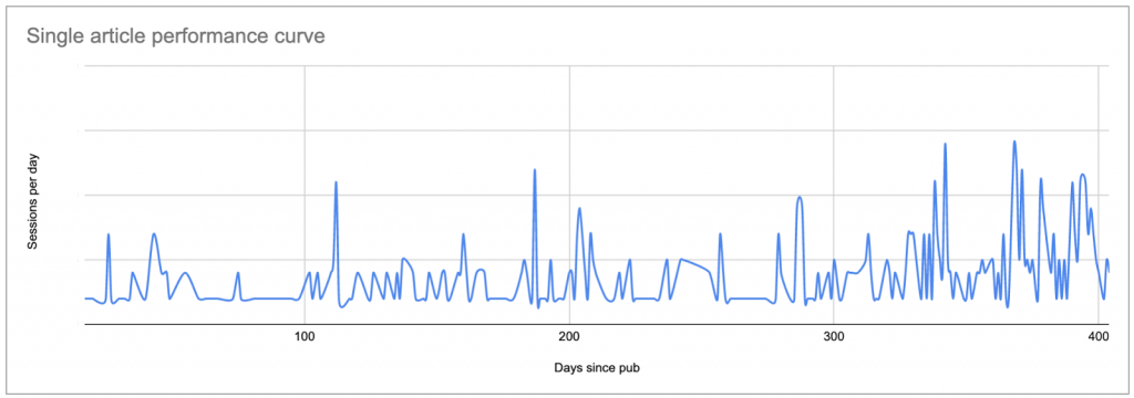
The easiest way to set a baseline is to look at average sessions per day after publication, per article, where day zero is the publication date.
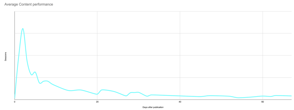
This will produce a curve that looks something like this, showing a peak of initial interest (and possibly the results of any promotion you do, if you haven’t limited your analysis to sessions from search engines only), followed by a long tail of lower interest:
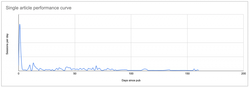
Real data for a typical post: a peak on or shortly after the publication date, followed by a long tail which, in many cases, eventually brings in more sessions than the original peak.
Once you know what each post’s curve looks like, you can compare each curve to the others, and establish what is “normal” and what isn’t.
If you don’t have a tool to do this, this is a pain in the neck.
When I started this project, my goal was to use Google Sheets to construct a proof of concept–before committing to learning enough Python to change how I examine content performance.
We’ll break the process down into phases and steps:
- Find your baseline
– List the content you want to study
– Find out how many sessions each piece of content received on each day
– Replace the date in the sessions list with the number of days since publication
– Calculate the “normal” curve to use as a baseline - Identify content that doesn’t look like the baseline
- Keep it up to date
Find your content performance baseline
List the content you want to study
To start with, you need to establish a list of the content you want to examine. For each piece of content, you’ll need the URL and the publication date.
You can go about getting this list however you want, whether you build it by hand or use an automated method.
I used an Apps Script to pull each content URL and its publication date directly from the CMS (in this case, Wordpress) using the API, and wrote the results to a Google Sheet. If you’re not comfortable with scripts or APIs, this is still relatively easy; you can find multiple examples online of how to do this for Wordpress.
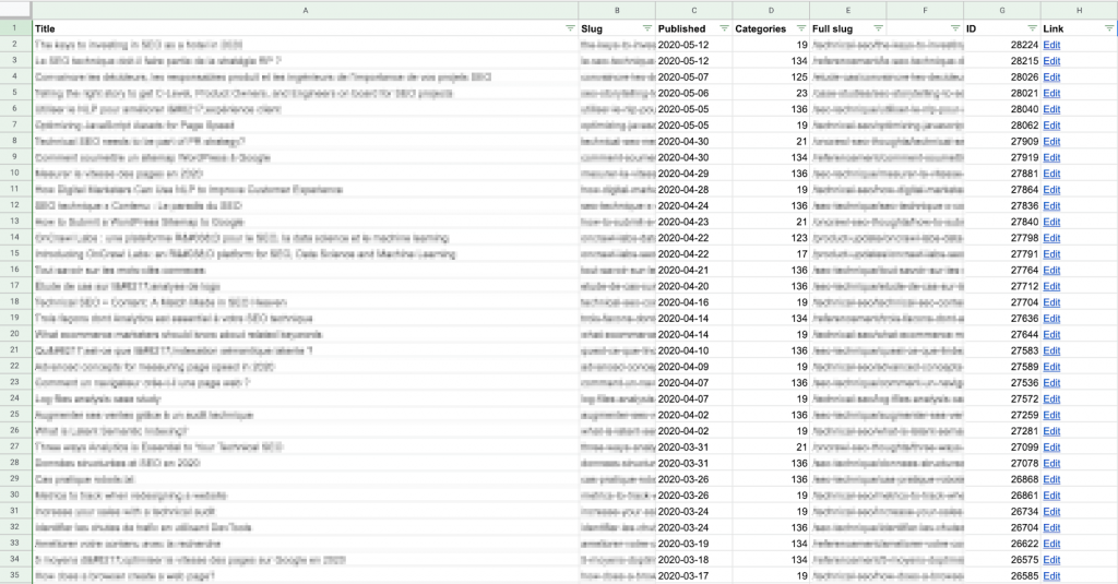
Keep in mind that you’re going to want to compare this data with session data for each post, so you’ll need to make sure that the “slug” on this sheet matches the format of the URL path provided by your analytics solution.
I find it’s easier to build the full slug (URL path) here, in column E above, rather than modifying the data pulled from Google Analytics. It’s also less computationally heavy: there are fewer lines in this list!

Example formula to create a full URL for this site: look up the category number provided by the CMS in a table and return the category name, which is placed before the article slug, matching the URL pattern for this site (https://site.com/categoryName/articleSlug/)
If you don’t have access to the backend, you can create your list by scraping this information from your website itself, for example, during a crawl. You can then export a CSV of the data you want, and import it into a Google Sheet.
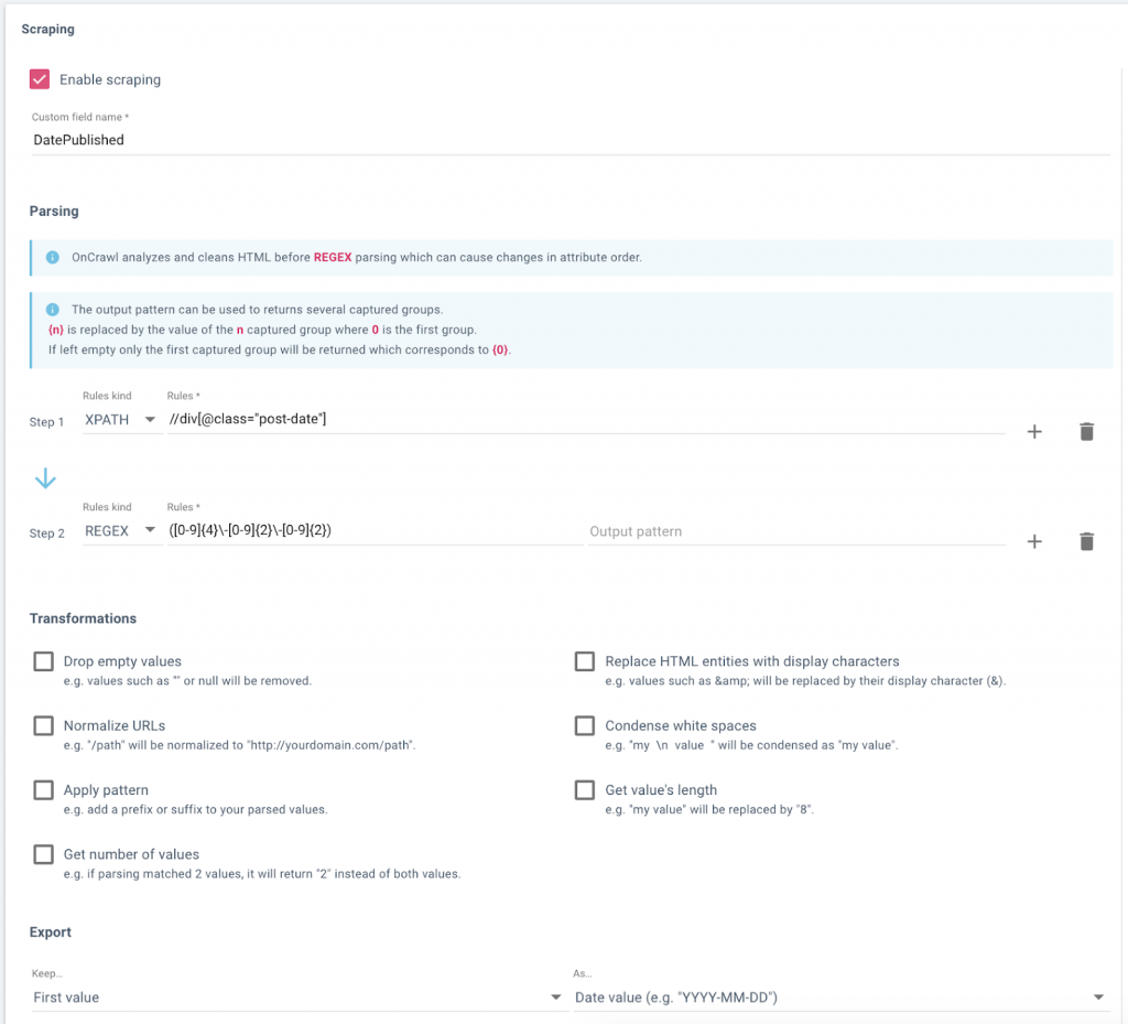
Setting up a data field in Oncrawl to scrape publication dates from a website’s blog.
Data, including URL and scraped publication date, in Oncrawl’s Data Explorer, ready for export.
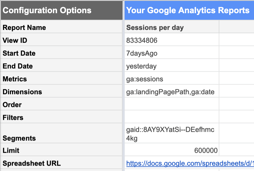
Find out how many sessions per day each piece of content has earned
Next, you need a list of sessions per content piece and per day. In other words, if a piece of content is 30 days old and received visits every day during that period, you want to have 30 rows for it–and so on for the rest of your content.
You’ll need a separate sheet in the same document for this.
The Google Analytics add-on to Google Sheets makes this relatively easy.
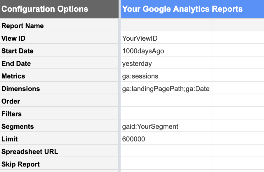
From the Google Analytics view with the data you want, you can request a report of:
| Dates | Metrics | Dimensions |
|---|---|---|
| From 1000 days ago Until yesterday.Today’s data is not yet complete because the day isn’t over yet. If you include it, it won’t look like a “normal” complete day and will bring all of your stats down. | Sessions We’re interested in the number of sessions. | Landing Pages This lists sessions for each landing page separately.Date This lists sessions for each date separately, rather than giving us a 1000-day total.. |
Using segments of your Google Analytics data is extremely helpful at this stage. You can, for example, limit your report to a segment containing only the content URLs you are interested in analyzing, rather than the entire site. This significantly reduces the number of rows in the resulting report, and makes the data much simpler to work with in Google Sheets.
Furthermore, if you intend to look only at organic performance for strictly SEO purposes, your segment should exclude acquisition channels which can’t be attributed to SEO work: referrals, email, social…
Don’t forget to make sure that the limit is sufficiently high enough that you aren’t going to truncate your data by mistake.
Calculate the number of days since publication
To calculate the number of days since publication for each data point in the article we have to join (or, if you’re a Data Studio user, “blend”) the data from the sessions report to the data in your list of content pieces.
To do so, use the URL or URL path as a key. This means the URL path needs to be formatted the same way in both the CMS table and the Google Analytics report.
I created a separate table so that I could scrub any parameters off of the landing page in my Analytics report. Here’s how I set up my columns:
- Landing page
Scrubs parameters from the URL slug in the Analytics report
Sample formula:

- Date
Date that the sessions were recorded, from the Analytics report
Sample formula:

- Sessions
Date that the sessions were recorded, from the Analytics report
Sample formula:

- Days after publication
Looks up the publication date for this URL in the column of the CSM table that we just created and subtracts it from the date these sessions were recorded on. If the URL can’t be found in the CMS table, reports an empty string rather than an error.
Sample formula:
![]()
![]()
Note that my lookup key–the full URL path–is not the leftmost column in my data; I’ve had to shift column E before column C for the purposes of the VLOOKUP.
If you have too many rows to fill this in by hand, you can use a script like the one below to copy the content in the first row and fill in the next 3450 or so:
function FillDown() {
    var spreadsheet = SpreadsheetApp.getActive();
    spreadsheet.getRange('F2').activate();
    spreadsheet.getActiveRange().autoFill(spreadsheet.getRange('F2:F3450), SpreadsheetApp.AutoFillSeries.DEFAULT_SERIES);
};
Calculate the “normal” number of sessions per day after publication
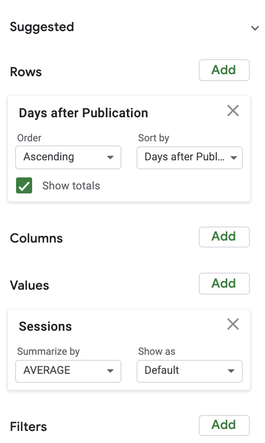
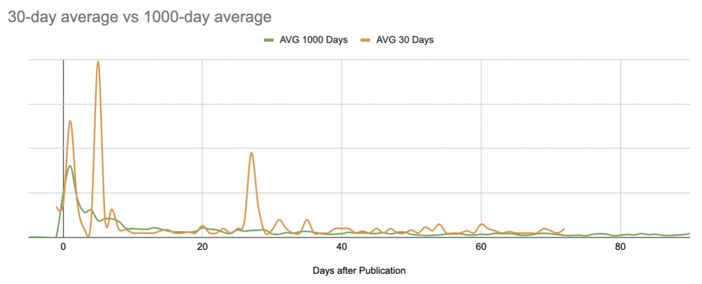
To calculate normal session numbers, I’ve used a pretty straightforward pivot table, paired with a graph. For simplicity’s sake, I’ve started by looking at the average number of sessions per day after publication.
Here’s the average versus the median of sessions over the 1000 days following publication. Here we begin (?) to see the limits of Google Sheets as a data visualization project:
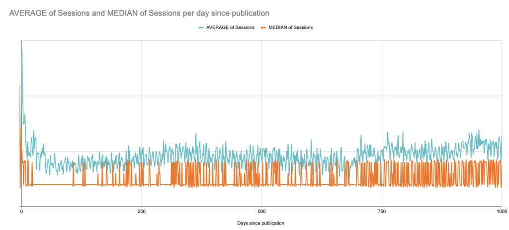
This is a B2B site with weekday session peaks across the full site; it publishes articles a few times per week, but always on the same days. You can almost see the weekly patterns.
In this case, for visualization purposes, it would probably be best to look at rolling 7-day averages, but here’s quick version that merely smooths by weeks since publication:
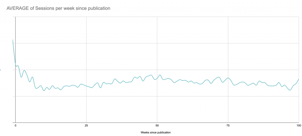
Despite this long-term view, for the next steps I’ll be limiting the graph to 90 days after publication in order to stay within Google Sheets’ limits later on:
The search for anomalies
Now that we know what the average post looks like on any given day, we can compare any post to the baseline to find out whether it is over- or under-performing.
This gets quickly out of “hand” if you’re doing it manually. Puns aside, let’s at least try to automate some of this.
Every post (that is less than 90 days old), needs to be compared to the baseline we’ve just established for each day in our 90-day window.
For this proof of concept, I calculated the percent difference from the daily average.
For a rigorous analysis, you will want to look at the standard deviation of sessions per day, and establish how many standard deviations the individual content piece’s performance is from the baseline. A session count that is three standard deviations from the average performance is more likely to be an anomaly than something that differs from the average for that day by over X%.
I used a pivot table to select every piece of content (with sessions in the past 90 days) that has at least one day of anomalies during that period:
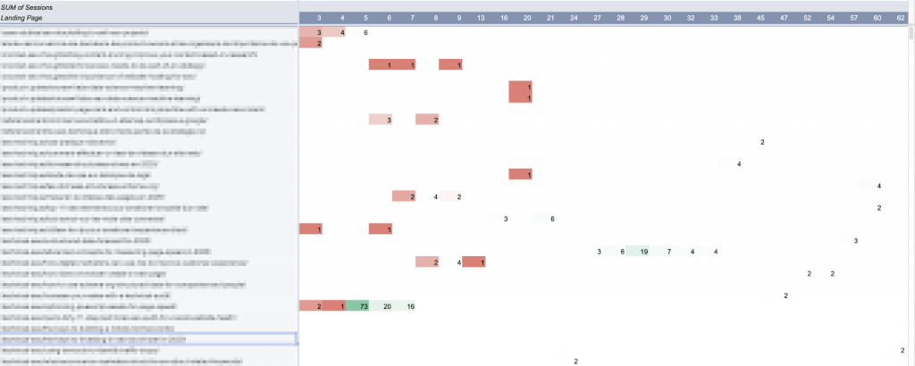
In Google Sheets, pivot tables are not allowed to create more than 100 columns. Hence the limitation of 90 days for this analysis.
I charted this table. (Ideally, I’d want to chart the entire 90-day curve for each of these articles, but I’d also like the sheet to respond if I click on a curve.)
Keeping things up to date: Automating updates
There are three major elements here:
- The baseline
- The pieces of content you want to track
- The performance of these pieces of content
Unfortunately, none of these are static.
Theoretically speaking, the average performance will evolve as you get better at targeting and promoting your content. This means you’ll need to recalculate the baseline every so often.
And if your website has seasonal peaks and troughs, it might be worthwhile to look at averages over shorter periods of time, or of the same period every year, instead of creating an amalgamation as we did here.
As you publish more content, you’ll want to track the new content, too.
And when we want to look at session date for next week, we won’t have it.
In other words, this model needs to be updated more or less frequently. There are multiple ways to automate updates, rather than re-building the whole tool from scratch every time you’re interested in taking a look.
The easiest to implement is probably scheduling a weekly update of analytics sessions, and pulling new posts (with their publication dates) at the same time.
The Google Analytics report we used can be easily scheduled to run automatically at regular intervals. The downside is that it overwrites past reports. If you don’t want to run and manage the full report, you can limit it to a shorter period of time.
For my purposes, I’ve found that looking at a 7-day window gives me enough information to work with without being too far out of date.
Keeping an eye on evergreen posts outside of the 90-day window
Using the data we generated earlier, let’s say it was possible to determine that most posts average around 50 sessions per week.
It therefore makes sense to keep any eye on any post whose weekly sessions are over 50, regardless of publication date:
Articles are colored by publication period: past 90 days (blue), past year (orange), and legacy (gray). Weekly totals are color-coded by comparing them to the session goal of 50.
Breaking the total sessions down per day in the week makes it easy to quickly differentiate between evergreen posts with fairly consistent performance versus event-driven activity with uneven performance:
![]()
![]()
Evergreen content (consistent performance of ±20/day)
![]()
![]()
Probable outside promotion (general low performance outside of a short-term peak)
What you do with this information will depend on your content strategy. You might want to think about how these posts convert leads on your website, or compare them to your backlink profile.
Limitations of Google Sheets for content analysis
Google Sheets, as you’ve likely noticed by this point, is an extremely powerful–but limited–tool for this sort of analysis. These limitations are why I’ve preferred not to share a template with you: adapting it to your case would take a lot of work–but the results you can get are still only approximations painted with broad strokes.
Here are some of the main points where this model fails to deliver:
- There are too many formulas.
If you have a lot (say, thousands) of active content URLs, it can be extremely slow. In my weekly update scripts, I replace a lot of the formulas with their values once they’re calculated so that the file actually responds when I open it later for analysis. - Static baseline.
As my content performance improves, I just have more content pieces “overperforming.” The baseline needs to be recalculated every few months to account for evolution. This would be easily solved using an unsupervised machine learning model to calculate averages (or even to skip this step and identify anomalies directly). - An “inaccurate” baseline.
The baseline doesn’t account for seasonal changes or site-wide incidents. It’s also very sensitive to extreme events, particularly if you limit your calculation to a shorter period of time:
Statistically unsound outlier analysis.
Particularly if you don’t have a lot of sessions per day per content item, claiming a 10% difference from an average constitutes unusual performance is a bit sketchy.
Arbitrary limit to 90 days of analysis.
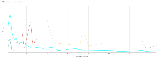
Any arbitrary limit is an issue. In this case, it prevents me from understanding evergreen content performance and makes me blind to any peaks in their performance–though I know from Google Analytics that very old pieces do occasionally get a sudden spike in attention, or that some articles steadily gain attention as they age. This is not visible in the tool, but it is if you chart their curve:
- Sheet length issues.
Some of my formulas and scripts require a range of cells. As the site and the lines in the sessions report grow, these ranges need to be updated. (But they can’t exceed the number of rows present on the sheet, or some of them create errors.) - Inability to graph full curves for each piece of content.
Come on, I want to see everything! - Limited interactivity with the graphed results.
If you’ve ever tried to pick out one point (or curve) on a multi-curve graph in Google Sheets… you know what I’m talking about. This is even worse when you have more than twenty curves on the same graph, and the colors start all looking the same. - Possibility of overlooking underperforming content with no sessions.
Using the method I’ve presented here, it’s hard to identify content that consistently has no sessions. Because it never appears on the Google Analytics report, it doesn’t get picked up in the rest of the workflow (yet). Content that consistently doesn’t perform brings little value, so unless you’re looking for pages to prune, non-performing content arguably doesn’t have its place on a performance report. - Inability to adapt to real-time analysis.
While it’s not particularly labor-intensive to re-run the reporting, averaging, and post update scripts, these are still manual actions outside of the weekly programmed update. If the weekly update is on Wednesday and you ask me on a Tuesday how things are doing, I can’t just consult the sheet. - Limitations on expansion.
Adding an axis of analysis–such as ranking or keyword tracking, or even filter options by geographic region–to this report would be onerous. Not only would it exacerbate some of the existing issues, but it would also be extremely difficult to implement a readable, actionable visualization.
The conclusion?
Running the same types of calculations in a machine learning or programmatical environment would address almost all of these issues. This would be a much better way of running semi-complex operations on a large set of data. Furthermore, there are excellent libraries that use machine learning to reliably detect anomalies based on a given dataset; there are better tools for data visualization.
Content performance takeaways
Content performance analysis, even with primitive and flawed methods, reinforces alerting and data-driven decision-making in content strategy.
Concretely speaking, understanding content performance is what allows you to:
- Understand the value of initial promotions vs long tail activity
- Spot poorly performing posts quickly
- Capitalize on outside promotion activities to boost reach
- Easily recognize what makes certain posts so successful
- Identify certain authors or certain topics that consistently outperform others
- Determine when SEO starts to have an impact on sessions
This data that drives informed decisions to promote content–and when and how–, subject-matter choices, audience profiling, and more.
Finally, experiments like this one show that any domain for which you can obtain data has a potential use for coding, scripting, and machine learning skills. But you don’t have to renounce making your own tools if you don’t have all of these skills.