In an ever-changing landscape of online user behaviour, the SEO experts are always experiencing new effects on their SEO efforts. One of the biggest transformations in recent times as we know is the shift towards a mobile-first world. This is due to user habits and the determination of Google with its mobile first indexing.
So let’s get into it!
What exactly is mobile parity? I hear some of you cry (apologies to those who already know what it is you can skip to the good stuff below :) ). Mobile parity consists of comparing the mobile version to the desktop version of your website to make sure that they are both equally optimized. This goes for a website that is fully responsive or a website that is split into a separate desktop and a separate mobile website, as discrepancies can happen in all.
There are a number of plus points as to why you should do a mobile parity audit for your website:
- Aligns user experience on each device
- Helps the flow of Pagerank, Link Juice, or whatever like to call it
- Makes sure all content can be seen equally
- Aids in reaching organic traffic goals
- Gives you a big tick from Google with their mobile first indexing
The common mobile parity issues that are found on websites can be quick SEO wins for developers to implement or sometimes can be a more lengthy process.
Mobile Parity Issues
No Breadcrumbs to follow
One of the biggest issues that gets thrown up when conducting a mobile parity audit is missing breadcrumbs on pages. These are especially important for e-commerce websites as they allow a clear path for search engines to reach products that buried in the site.
This tends to be an issue when working with a responsive website as usually there will be breadcrumbs on the desktop website like there should be. Although when the same website is shrunk the breadcrumbs disappear to make room for more other variables on the page, as the real estate becomes more precious.
This is where the world of UX and SEO combine more so. Checking that you have eyes on a new website page design or recent change is important in making sure breadcrumbs are kept as part of the site if you’re using them.
Quick Tip – This may seem common sense but when doing a mobile parity audit or even website front end changes are made make sure you get your phone out see that the change looks as you would expect it to. I say this as you would be surprised at the number of people who just check the desktop site and assume it’s all ok just because they’re working on a desktop. The chances are a user coming to the website later on will not be on a desktop and may see an issue which could cause them to leave and lose you your conversion.
Missing Content
Just like breadcrumbs can go missing content can also go missing on a website because of a mobile first world, so again keep an eye out for content on desktop site and make sure it makes its way to the mobile site. As we all know “content is king” and holds a great deal of value in your websites organic authority. As screens get smaller on mobile Google have said their able to read content that is hidden in tabs and read more sections, make the most of the space by using these.
Site Menus
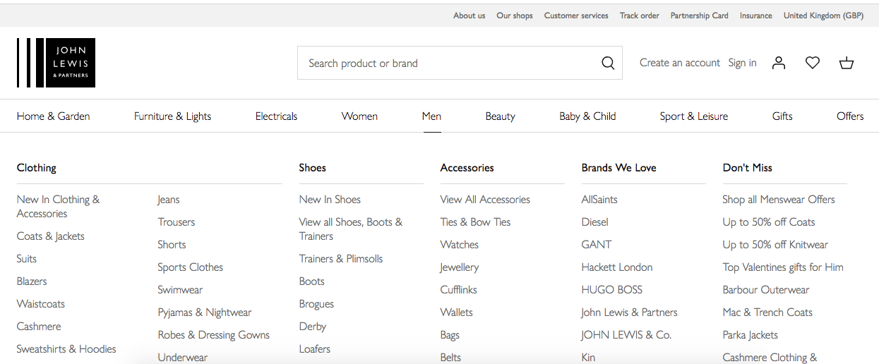
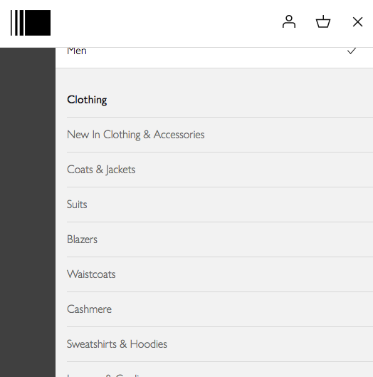
Website navigations hold the path to the key pages on the site for crawlers, allowing them to follow the pages you want them to see. If you have two separate sites ensuring that both menus match up and feed to the right places you want is very important.
Good Example – John Lewis
They’ve got a responsive website that includes all the navigational links on desktop and mobile screens, nice and simple!
Desktop

Mobile

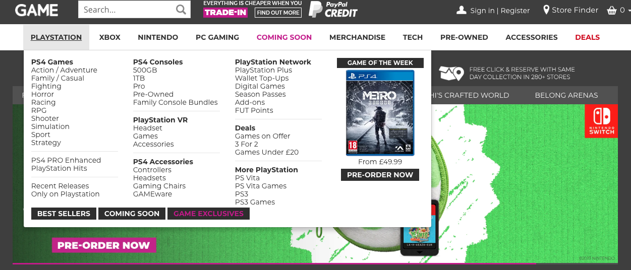
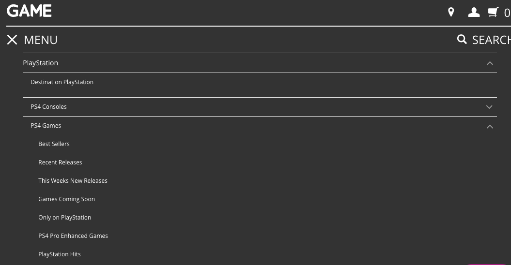
Bad Example – Game.co.uk
GAME’s website is not fully responsive and runs a desktop and a mobile version as we can see from the screenshots there doing a bad job in matching up their menus. On the two sites in the examples, it shows PS4 games are being linked off to totally different variations, which is just one of the mismatches in the navigations.
Desktop

Mobile

Under the hood
Behind all the pretty stuff there is another world full of code that also needs to be thought about when dealing with mobile parity. Especially if you have two separate websites, as there is a wealth of elements that will differ and there best to sanity check even if you are sure.
Think about these elements:
- Canonicals referencing correct page
- Redirects pointing to correct site version
- No Index and No Follow tags on pages
- Meta titles and meta descriptions
- Sitemaps
- Robots.txt file is correct
- Href lang is correct if have international versions
Hopefully this all shines some light on the world of mobile parity for you, along with the kinds of things you should be looking out for and what to do and what not to do. Although mobile-first thinking has been around for a while these type of problems still occur so don’t forget to check your desktop and mobiles versions.

