Only content is not enough for a website to succeed. Other factors like loading speed, crawlability, navigation, website structure, responsiveness, and the security play an equally crucial role. The term for this is technical SEO, which experts call the backbone of a website because, without it, everything else will fall apart.
Technical SEO is one factor that can either make or break your search rankings. If you do it right, you will be rewarded with top search rankings and rich results. But if you make mistakes, search engines will penalize or even block your website from crawling in their searches. Hence, it is crucial to do technical SEO right.
Doing technical SEO right is even more essential in mobile searches as the number of smartphone users is growing exponentially, and Google has entirely put mobile phones at the core of its search engine algorithms since 2017.
That is why we are here with this comprehensive guide in which we will:
- Look at technical SEO from the mobile phone perspective
- Learn how to find out if your website is technically optimized for mobile.
- Know the key aspects of mobile technical SEO and how to do them correctly.
- Learn about critical mobile technical SEO mistakes that we should avoid at any cost.
By the end of this technical guide, you will know how you can achieve maximum results from mobile technical SEO by doing it right. Let’s begin:
Understanding Technical SEO from Mobile Phone Perspective
According to the stats from Hitwise, 58% of searches happen from mobile phones.
This means there are greater chances that most of your website visitors are smartphone users.
Now, what if your website is not optimized for mobile phones?
What if it is too heavy to load on smartphones and not even responsive?
Visitors will quickly jump to another website, which will increase the bounce rate and negatively impact your search rankings.
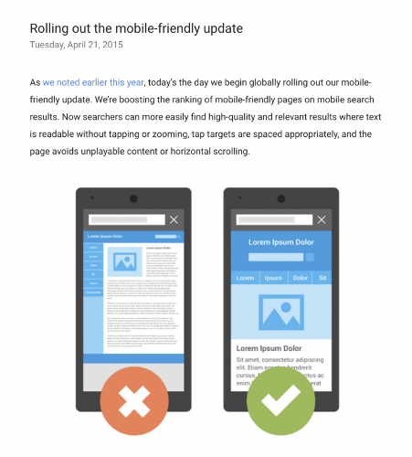
Google will also not favour your website for search rankings if it is not mobile-friendly as the search engine has already made it clear in its first mobile-friendly update also called Mobilegeddon that it will boost the ranking of mobile-friendly pages on mobile searches.

Google even made every search mobile-specific by rolling out the mobile-first indexing update in 2019. It means that even if someone is searching from the desktop, Google will show results only from the mobile index.
Now, if your website is not optimized for mobile phones, your search rankings will suffer. Hence, it is essential to ensure that your website is technically optimized and user-friendly for mobile phones.
How to Know if Your Website is Technically Optimized for Mobile?
An ideal technically optimized website will:
- Load quickly across as the mobile users will expect.
- Have all the links and redirects working.
- Correctly navigate. There will be no dead ends.
- Not hide any content when someone is visiting it from mobile.
- Have a simple and user-friendly interface that visitors find pleasing.
- An ideal technically optimized website is secure.
If your website fulfills all these criteria, then it is technically optimized for mobile. Otherwise, you must do its mobile technical SEO.
You can also use Google’s mobile usability test to see if your website is optimized for mobile users. It will show you if mobile users have trouble using your website.
Google’s mobile-friendly test is another way to see if your website is appealing to mobile users or not.
Key aspects of Mobile Technical SEO & How to Get them Right?
Website Loading Speed
Stats have proven that more than 53% of visitors leave if a website takes more than 3 seconds to load. Above this, if there is even a delay of 1 second in your website’s loading speed, its bounce rate will increase by 32%.
Now, imagine how many valued customers you will lose to your competitors if you don’t fix your website’s loading speed. The risk is even higher if your visitors are coming from mobile because they have more apps and more reasons to get distracted.
That is why it is essential to fix your website’s loading speed and make sure it loads faster. Here are a few ways for doing so:
- Compressing CSS, HTML, and JavaScript files to reduce their size
- Optimizing your code by reducing unnecessary spaces, commas, and other unnecessary characters
- Reducing the number of redirects. Doing so is crucial because every time a page redirects to another page, the visitor will face additional time waiting for the HTTP request-response cycle to complete
- Removing render-blocking JavaScripts. Even Google suggests doing so
- Using browser caching to load your website faster
- Improving the server response time
- Using a content distribution network (CDN) so that visitors have fast and reliable access to them
- Optimizing images as the large ones take a long time to load, thus reducing the loading speed
You can also implement accelerated mobile pages (AMP) for boosting your website’s loading speed. AMP is an initiative by Google that helps mobile pages load faster by stripping away unnecessary content. Here is what accelerated mobile pages (AMP) look like:

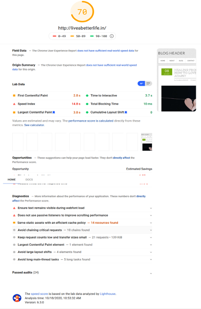
Don’t want to jump into much technicality? In that case, you can use Google’s PageSpeed Insights feature. It will give you a score based on your website’s speed and present suggestions on how you can improve it.
Using the PageSpeed Insights feature is also very simple. Just open the link, enter your website’s URL, and click Analyze. Your website’s score and suggestions on how you can improve it will be in front of you.

2. Website Structure
Slow websites are frustrating. But the ones that are hard to navigate are more annoying. Nothing irritates visitors more than either landing on a page that doesn’t exist or reaching a dead point on the website from where they can navigate any further.
Even search engines don’t favour complex website structure, dead links, or 404 error pages. They will penalize you for having them on your website, and your search rankings will plummet.
So, it is essential to take care of the website structure. Here are a couple of tips you can follow:
- While building a website, make sure users don’t have to click more than three times for navigating to any page.
- Use breadcrumbs in addition to the primary navigation on your website.
- Leave no orphan pages or dead links that may lead to 4O4 errors on your website. If there are any, fix them as soon as possible.
Tracking 404 error pages is easy. All you need is to:
- Use an SEO crawler like Oncrawl to list error pages on your site
- Visit your Google Analytics account and go to Behaviour –> Site Content –> Content Drilldown, search for 404.html
You will find a ton of info about all the 404 links on your website:

Using this list, you can fix all 404 errors by redirecting them and deleting dead links. However, make sure you are redirecting these links to a page that replaces the old page, not just to the home page.
3. Duplicate Content
Paying attention to duplicate content is crucial while doing mobile technical SEO of a website. Otherwise, it can harm your search rankings.
Duplicate content makes it hard for bots to decide which page is the most relevant so that they can rank it higher. As a result, these bots get confused and show both pages at low rank.
Another big problem with duplicate content is that it can be difficult to track unless you are using tools like SEMrush or Oncrawl.
The best way to resolve the issue of duplicate content is to use canonical tags that tell search engine bots that a specific URL is the “master” page.
However, the issue with this specific approach is that you may accidentally end up adding duplication on your website. Hence, I recommend doing canonicalization using 3O1 redirects. You can also use parameter-handling tools in Google Webmasters for this purpose.
4. Responsive Design
Slow loading speed and poor navigation are not only two things that turn OFF website visitors. Visiting a website from a mobile phone and encountering the desktop version is equally frustrating.
So, having a responsive design for a website is a must not just from the user experience point of view but also the mobile technical SEO perspective.
Here is why a website should have a responsive design, according to Google Developers:
- Responsive design makes it easier for website visitors to link and share your content using a single URL.
- Algorithms can easily assign index properties to your website if they have a responsive design.
- Responsive design reduces load time and redirection errors that commonly affect user experience.
- Responsive design can save many resources as it only needs to retrieve all the versions of content only once.
So, a responsive design can give you a competitive edge.
Here is how you can optimize your website’s design to make it responsive:
- Scale images according to the mobile screen.
- Have an easy to view navigation menu which mobile users can easily navigate through.
- Avoid using pop-ups that cover the entire screen. Instead, the pop-up images should leave space for the reader to see the content.
- Create special effects using HTML5 instead of flash.
- Make calls-to-action clear and visible.
- Keep your text short so that mobile visitors can easily read them.
5. Crawlability
Crawlability plays a crucial role in mobile technical SEO. No matter how much keyword research you are doing or how much quality content you are creating, your website will not rank well if search engines do not crawl it.
If you want organic traffic on your website, you need to make sure that search engine bots easily crawl the content on it.
Crawling is what helps search engines understand which content on the website is crucial so that they can display it in high search rankings. You can also use it to instruct search bots not to crawl content pages that you feel are not crucial.
So, it’s important to make sure search engines are having no difficulty in crawling your website. Here is how you can see if Google is crawling your website or not:
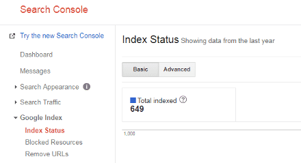
- Log in to your Google Search Console
- Click Google Index –>Index Status
The number of total indexed pages will appear like this:

If the total number of indexed pages is equal to the total number of pages on your website, you are great to go.
But what if Google is not crawling all website pages?
In that case, these can be the possible reason:
- Your website is brand new, and Google is taking a while to crawl its pages.
- You have accidentally used the “noindex” tag on these pages. This tag instructs the search engine to not include your page in the search results.
- Your website has orphan pages (the ones without any links or navigation pointing to them). Google doesn’t consider them worth indexing.
Robots.txt file errors can be another big reason behind website crawlability issues. Robots.txt files are responsible for directing bots to your website pages. Here is what a robots.txt file looks like:

While robots.txt files appear simple, you should handle them carefully. One small mistake can prevent robots from crawling critical parts of your website. For example, you can unintentionally block your website’s CSS and JS in the robots.txt file. Because CSS and JS can be used to display content and links, these issues can result in search engines not crawling some parts of your site.
If that is the case, you can fix the crawlability issue by modifying the robots.txt file.
6. XML Sitemap
An XML sitemap serves as a roadmap for search engines on your website and ensures they don’t miss any important content on it. For this reason, it should be a crucial part of your mobile technical SEO approach.
XML sitemaps are even more helpful when you have a large website or the structure of your website is not that good, as it helps search engines find your important content.
Moreover, creating XML sitemaps is very easy. Plenty of WordPress plugins like XML Sitemap & Google News Feeds and Yoast SEO are available. Using them, you can quickly generate the XML sitemaps for your website.
Once you generate your XML sitemaps, submit them to Google Search Console to improve the search rankings of your website. You will see a difference.
Oncrawl Log Analyzer
7. Security
With the increases in cases of data theft and scandals like Cambridge Analytica, people have grown more concerned about their privacy. No visitor would ever want to visit a website that’s not secure. For this reason, website security is a necessity these days.
Even Google acknowledges the importance of website security and has made HTTPS as a ranking signal for websites. So, if you want your website to rank high in Google searches, make sure it’s secure.
Checking whether your website is HTTPS or not is very easy. If you see a lock on the left-hand side of your browser’s search bar, it’s secure. Other, you need to purchase an SSL certificate.
Here are a few other ways you can make your website secure:
- Not using default username for admin account
- Protecting the website admin account with a complex and unique password
- Using Two-factor authentications
- Employing lead privileged principles
- Hiding wp-config.php and .htaccess files
- Using security keys for authentication
- Disabling file editing
- Limiting login attempts
- Putting multiple security layers in place
- Monitoring website from time to time
Bonus Tips to Nail Your Website’s Mobile Technical SEO
- Replace heavy plugins and elements that are slowing down your website. You will see a significant improvement in its loading speed.
- Focus on the technicality but also not forget the user experience. It should be at the heart of your mobile technical SEO strategy.
- Make your website mobile-friendly. Not only will it keep your visitors hooked, but search engines will also favour it.
- Don’t waste your crawl budget on duplicate/thin content. Otherwise, you will run out of resources for the stuff that matters.
- Use redirects wisely as too many of them can negatively impact your website’s technical SEO efforts.
I would also recommend you to do A/B testing. It always yields results, no matter if you are preparing a social media plan, testing the user experience of your website. Even today I was reading this blog mentioning some successful A/B testing examples.
Since, A/B testing works so well for just about everything, it will also work for your website’s mobile technical SEO efforts for sure.
Takeaway
By now, you might have understood that mobile technical SEO is not as daunting as it seems. By paying attention to some simple yet critical aspects of your website in mind and taking some wise measures, you can make the most out of your mobile technical SEO efforts.
To conclude the entire guide, you can easily rank high for mobile-specific searches with the following mobile technical SEO measures:
- Reduce your website’s loading speed.
- Make sure your website is well-structured and easy to navigate.
- Do not confuse search engines with duplicate content pages.
- Make your website mobile-friendly and responsive.
- Fix crawlability issues on high priority because if search engines are not crawling your website, no keyword research or quality content creation will work.
- Make your website secure by purchasing an SSL certificate and taking all necessary security measures.
Now you know what to do for achieving maximum results from the mobile technical SEO of your website.
However, just reading the guide is not going to help. To achieve results, you must practically apply what you learned.
Implement all these technical SEO tips on your website, observe the results, and share your growth with the world.
Which of these technical SEO measures will you implement on your website first? Please let us know in the comments.

