
We have multiple indications that the relative importance of a page on a site influences the rank Google assigns it. Whether we’re talking about internal linking case studies, link juice transfer, PageRank, or even site organization strategies like category and pillar pages, it’s clear that some pages on your site are better candidates than others for top ranks in Google.
Your website might bring back memories of high school. On one hand, you have groups of pages that are the quarterbacks and the cheerleaders of your site. On the other hand, some groups are more like the chess team. Sometimes there are groups with a lot of popularity, but you really wish that wasn’t the case.
Your job as an SEO is to find the groups of pages that need more popularity, the groups of pages that have too much popularity, and make them talk to one another. But how can you visualize–and control–popularity within your site? Oncrawl has the answer.
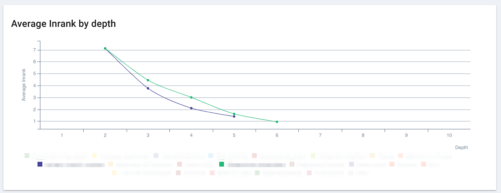
The effect of popularity: it’s better to be part of the green group than the blue group on this site, even through at a depth of 2, you can’t tell the difference between the two!
What is Inrank?
Oncrawl uses a metric, called Inrank, to measure the popularity your site attributes to each page. We calculate this similarly to PageRank. Inrank is based on two main factors:
- The distance from important pages, like the home page: Inrank declines as page depth increases.
- The number and weighted importance of incoming links: pages transfer their Inrank through links. Inlinks from popular pages transfer more popularity than inlinks from unpopular pages. Oncrawl also takes into account follow/nofollow attributes.
We use a chart called the Inrank Flow to show you how popularity is transferred among groups of pages. You can also use this chart to test what happens to popularity when you take certain groups out of the picture.
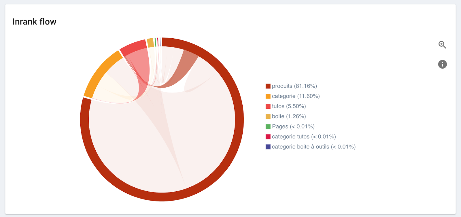
This chart shows the flow of popularity into and out of each group.
- Each group takes up a percentage of the circumference of the circle proportional to the amount of popularity it has on the site.
- Between each pair of groups that interact, an arc shows how popularity is transferred between them.
- The size of the base of the arc is proportional to the out-going popularity from each group.
- The arc takes the color of the group that sends more popularity than it receives.
How it works
This works best if you segment your pages in a meaningful way. Your page groups should represent real sets of pages on your site, and allow you to differentiate between supporting pages, landing pages, and money pages. If you’re running an e-commerce site, for instance, you should be able to tell your category pages from your product pages.
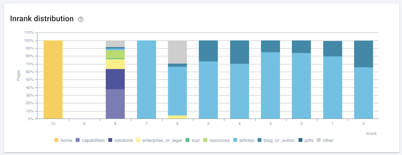
An example of a meaningful segmentation that could be improved. The pages with an Inrank of 8 in the “other” category are worth looking into: they were unimportant to this site’s manager, who didn’t place them in a key page group–but the site’s popularity distribution says otherwise!
First, find the group of pages that need a boost from SEO. If you’re working with an e-commerce site, these will most likely be your category pages. Remember: product pages are too prone to modification and too numerous to be an effective target for certain SEO optimizations. What’s more, Google usually finds and ranks them reasonably well without an extra boost. And supporting pages, like blog posts, are great at driving traffic, but they aren’t part of the funnel driving purchases on your site.
You can see how popularity flows to and from category pages by hovering over the group in the Inrank flow graph’s legend. Here, we’ve hovered over the orange group called “categorie”:
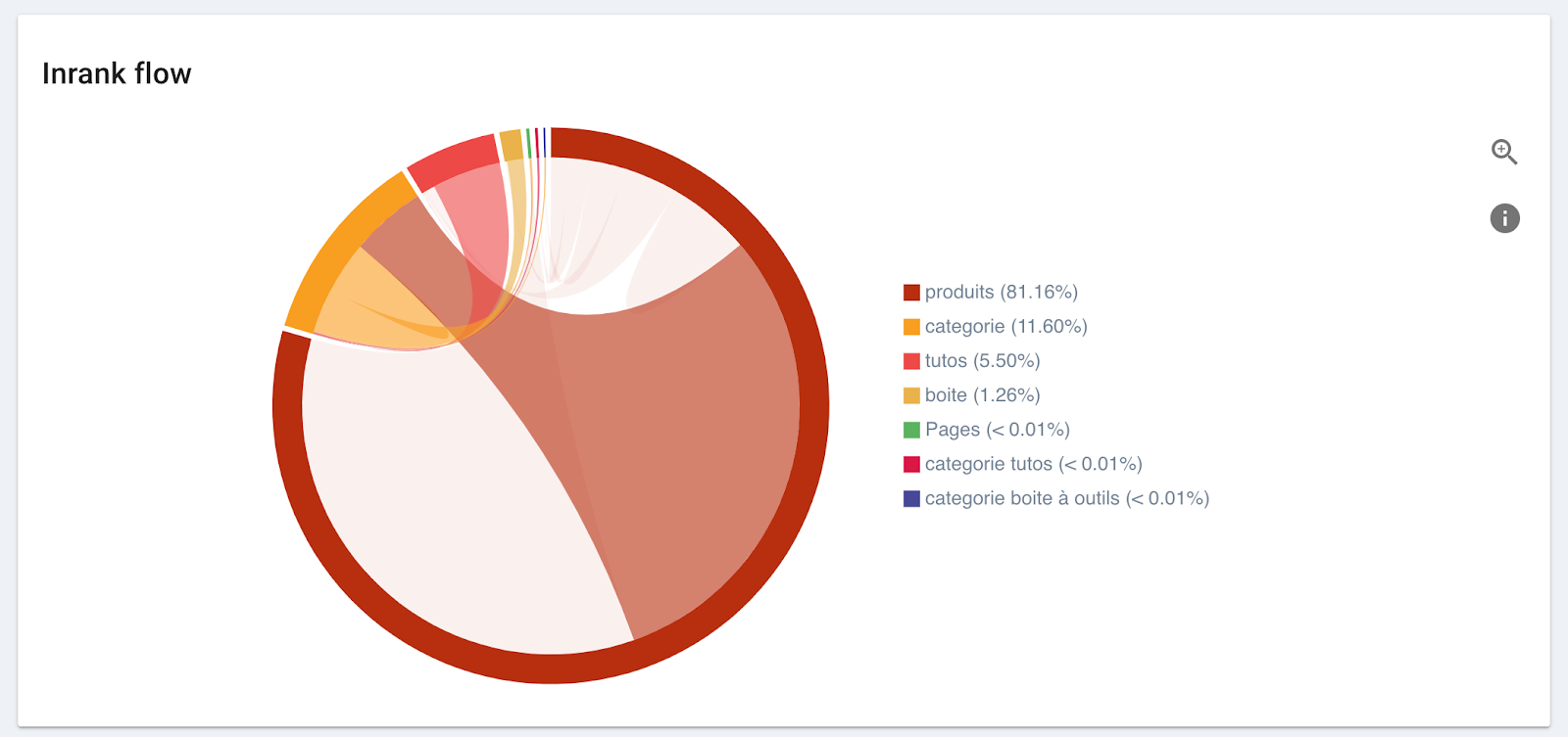
Then, look at where the category pages’ popularity is coming from:
- Does the most popular group (the one with the most presence along the circumference of the circle) send popularity to them? If so, the flow between the most popular group and the group we’re looking at will be the color of the popular group.
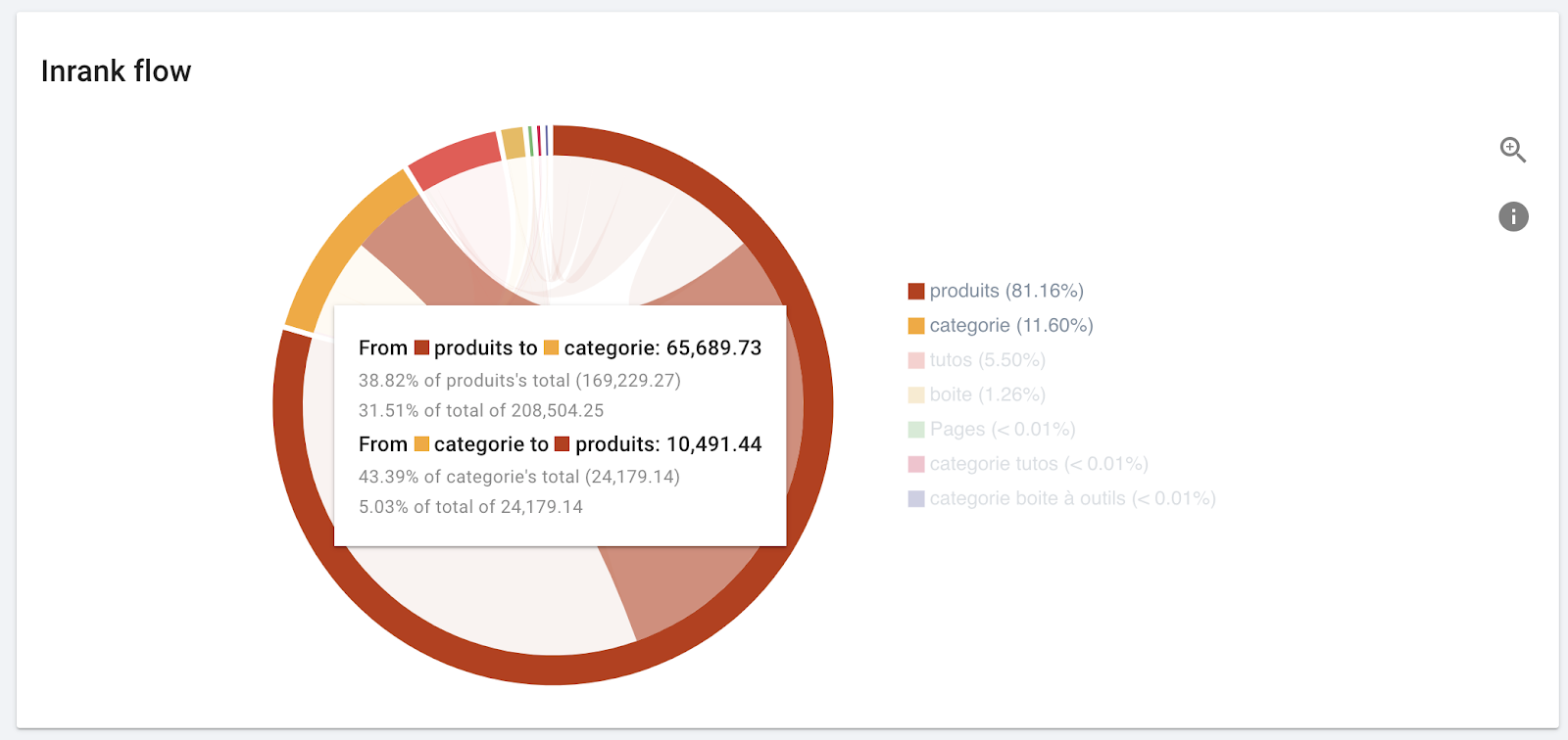
Hovering over an arc reveals additional information. The most popular group (“produits”) sends almost 40% of its popularity to the group we want to boost (“categorie”), which constitutes about a third of the popularity for the group “categorie”.
- Do groups you identified as supporting groups send flows of their own colored popularity to this group?
- When these pages give away popularity (flows that are the same color as the group we’re looking at), does it go to important groups?
Now, look at the supporting groups of pages, like blogs, whose job is to gain traffic to increase your site’s authority and visibility:
- Do they send popularity to the right places? The largest portion of the out-going flow should go to your top priority groups for SEO and be the color of the supporting group.
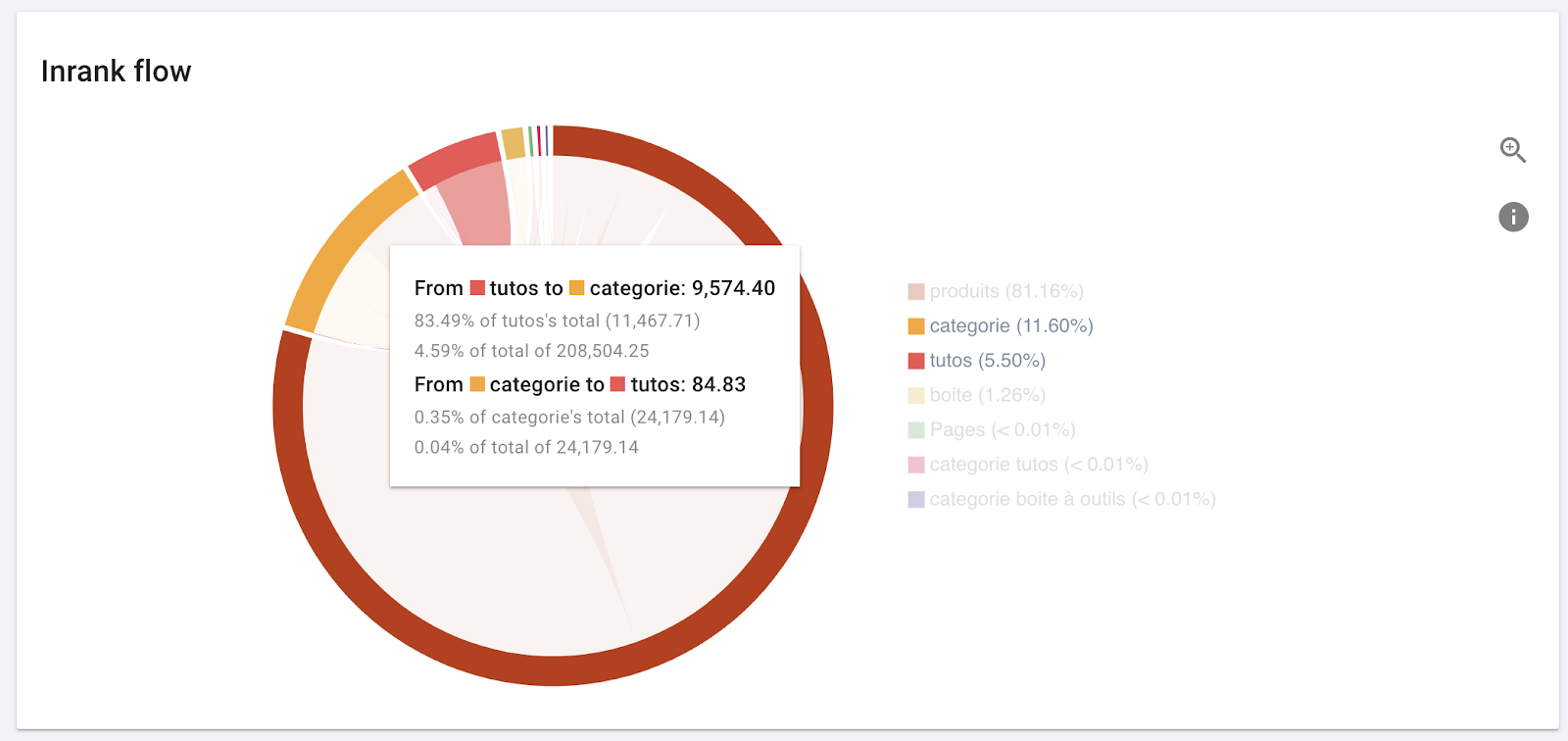
This is exactly what we expect to see.
- If they receive popularity from other groups, can these groups spare the popularity, or are they being hurt by the association?
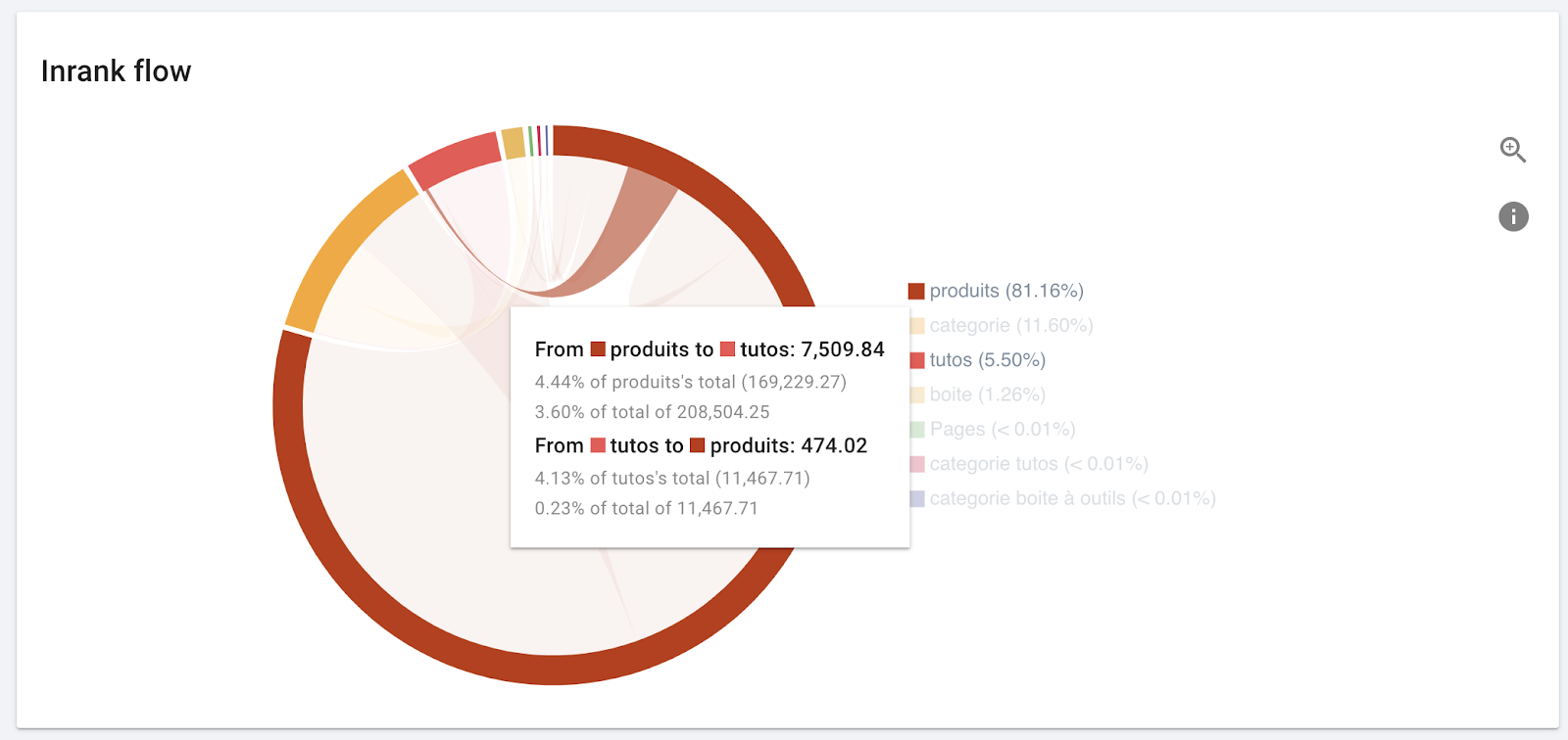
This looks ok. “Produits” has popularity to spare.
It’s your turn to promote the right groups of pages on your site
Even when on-page optimization and content quality are about the same, the difference in page popularity on your site can translate to a big difference in rankings. Using the Inrank flow diagram in Oncrawl, you will always know which page groups dominate the social scene on your site, and which groups they share their popularity with.