
As most of our work revolves around data, and as the field of Data Science is becoming much bigger, and much more accessible to beginners, I’d like to share some thoughts on how you might get into this field to augment your SEO and marketing skills in general.
What is the science of data?
A very well-known diagram that is used to give an overview of this field is Drew Conway’s Venn diagram showing Data Science as the intersection of statistics, hacking (advanced programming skills in general, and not necessarily penetrating networks and causing harm), and substantive expertise or “domain knowledge”:
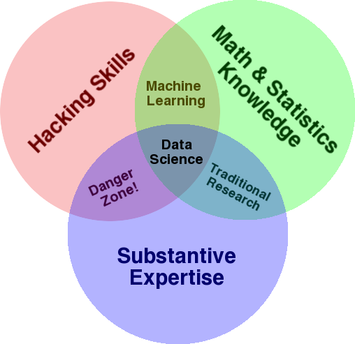
Source: oreilly.com
When I started learning, I quickly realized that this is exactly what we already do. The only difference is that I was doing it with more basic and manual tools.
If you look at the diagram, you’ll easily see how you probably already do this. You use a computer (hacking skills), to analyze data (statistics), to solve a practical problem using your substantive expertise in SEO (or whatever specialty you focus on).
Your current “programming language” is probably a spreadsheet (Excel, Google Sheets, etc.), and you most likely use Powerpoint or something similar for communicating ideas. Let’s expand on these elements a little bit.
- Domain knowledge: Let’s start with your main strength, as you already know about your area of expertise. Keep in mind that this is an essential part of being a data scientist, and this is where you can build on, and protect, your knowledge. A few months ago, I was discussing analyzing a crawl dataset with a friend of mine. He is a physicist, doing post-doctoral research on quantum computers. His math and statistics knowledge and skills are way beyond mine, and he really knows how to analyze data way better than me. One problem. He didn’t know what a “404” was (or why we would care about a “301”). So, with all his math knowledge he wasn’t able to make sense of the “status” column in the crawl dataset. Naturally, he wouldn’t know what to do with that data, who to talk to, and what strategies to build based on those status codes (or whether to look elsewhere). You and I know what to do with them, or at least we know where else to look if we want to dig deeper.
- Math and statistics: If you use Excel to get the average of a sample of data, you are using statistics. The average is a statistic that describes a certain aspect of a sample of data. More advanced statistics will help in understanding your data. This is essential also, and I’m not an expert in this area. The more statistical distributions you are familiar with, then more ideas you have about how to analyze data. The more fundamental topics you know the better you get at formulating your hypotheses, and making precise statements about your datasets.
- Programming skills: I’ll discuss this in more detail below, but mainly this is where you build the flexibility of telling the computer to do exactly what you want it to do, as opposed to being stuck with easy-to-use but slightly restrictive tools. This is your main way of obtaining, reshaping and cleaning your data, whichever way you want, paving the way for you to have open-ended and flexible “conversations” with your data.
Let’s now take a look at what we typically do in Data Science.
The data science cycle
A typical data science project or even task, usually looks something like this:
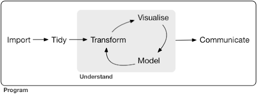
Source: r4ds.had.co.nz
I also highly recommend reading this book by Hadley Wickham and Garrett Grolemund which serves as a great introduction to Data Science. It is written with examples from the R programming language, but the concepts and code can easily be understood if you only know Python.
As you can see in the diagram, we first need to import our data somehow, tidy it, and then start working on the inner cycle of transform, visualize, and model. After that we communicate the results with others.
Those steps can range from extremely simple to very complex. For example, the “Import” step might be as simple as reading a CSV file, and in some cases might consist of a very complicated web scraping project to get the data. Several of the elements of the process are full-fledged specialties in their own right.
We can easily map this to some familiar processes that we know. For example, you might start by getting some metadata about a website, by downloading its robots.txt and XML sitemap(s). You would probably then crawl and possibly also get some data about SERP positions, or link data for example. Now that you have a few datasets, you probably want to merge some tables, impute some additional data and start to explore/understand. Visualizing data can expose hidden patterns, or help you figure out what is going on, or maybe raise more questions. You probably also want to model your data using some basic statistics, or machine learning models, and hopefully get some insights. Of course, you need to communicate the findings and questions to other stakeholders in the project.
Once you are familiar enough with the various tools available for each of these processes, you can start to build your own custom pipelines that are specific to a certain website, because every business is unique, and has a special set of requirements. Eventually, you will start to find patterns and won’t have to redo the whole work for similar projects/websites.
There are numerous tools and libraries available for each element in this process and it can get quite overwhelming, which tool you choose (and invest your time in learning). Let’s take a look at a possible approach that I find useful in selecting the tools that I use.
Choice of tools and trade-offs (3 ways of having a pizza)
Should you use excel for your day to day work in processing data, or is it worth the pain to learn Python?
Are you better off visualizing with something like Power BI, or should you invest in learning about the Grammar of Graphics, and learn how to use the libraries that implement it?
Would you produce better work by building your own interactive dashboards with R or Python, or should you just go with Google Data Studio?
Let’s first explore the trade-offs involved in selecting various tools at different levels of abstraction. This is an excerpt from my book about building interactive dashboards and data apps with Plotly and Dash and I find this approach to be useful:
Consider three different approaches to having a pizza:
- The ordering approach: You call a restaurant and order your pizza. It arrives at your doorstep in half an hour, and you start eating.
- The supermarket approach: You go to a supermarket, buy dough, cheese, vegetables, and all other ingredients. You then make the pizza yourself.
- The farm approach: You grow tomatoes in your backyard. You raise cows, milk them, and convert the milk to cheese, and so on.
As we go up to higher-level interfaces, towards the ordering approach, the amount of knowledge required decreases a lot. Someone else holds responsibility, and quality is checked by the market forces of reputation and competition.
The price we pay for this is the diminished freedom and options. Each restaurant has a set of options to choose from, and you have to choose from those options.
Going down to lower levels, the amount of knowledge required increases, we have to handle more complexity, we hold more responsibility for the outcomes, and it takes much more time. What we gain here is much more freedom and power to customize our outcomes the way we want. Cost is a major benefit as well, but only on a large enough scale. If you only want to have a pizza today, it’s probably cheaper to order it. But if you plan on having one every day, then you can expect major cost-savings if you do it yourself.
These are the kinds of choices that you will have to make when choosing which tools to use and learn. Using a programming language like R or Python requires much more work, and is more difficult than Excel, with the benefit of making you much more productive and powerful.
The choice is also important for each tool or process. For example, you might use a high-level and easy to use crawler to collect data about a website, and yet you might prefer to use a programming language to visualize the data, with all the available options. The choice of the right tool for the right process depends on your needs and the trade-off described above can hopefully help in making this choice. This also hopefully helps address the question of whether or not (or how much) Python or R you want to learn.
Let’s take this question a bit further and see why learning Python for SEO might not be the right keyword.
Why “python for seo” is misleading
Would you want to become a great blogger or do you want to learn WordPress?
Would you want to become a graphic designer or is your goal to learn Photoshop?
Are you interested in boosting your SEO career by taking your data skills to the next level, or do you want to learn Python?
In the first five minutes of the first lecture of the computer science course in MIT, professor Harold Abelson opens the course by telling the students why “computer science” is such a bad name for the discipline that they are about to learn. I think it’s very interesting to watch the first five minutes of the lecture:
When some field is just getting started, and you don’t really understand it very well, it’s very easy to confuse the essence of what you are doing, with the tools that you use. – Harold Abelson
We are trying to improve our online presence and results, and a lot of what we do is based on understanding, visualizing, manipulating and handling data in general, and this is our focus, regardless of the tool used. Data Science is the field that has the intellectual frameworks to do that, as well as many tools to implement what we want to do. Python might be your programming language (tool) of choice, and it’s definitely important to learn it well. It’s also as important, if not more important, to focus on the “essence of what you are doing”, processing and analyzing data, in our case.
The main focus should be on the processes discussed above (importing, tidying, visualizing, etc.), as opposed to the programming language of choice. Or better, how to use that programming language to achieve your tasks, as opposed to simply learning a programming language.
Who cares about all these theoretical distinctions if I’m going to learn Python anyway?
Let’s take a look at what might happen if you focus on learning about the tool, as opposed to the essence of what you are doing. Here, we compare searching for “learn wordpress” (the tool) vs. “learn blogging” (the thing we want to do):
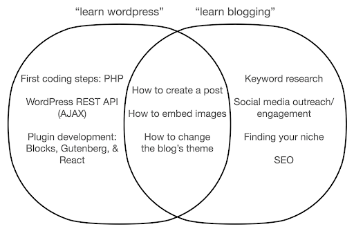
The diagram shows possible topics under a book or course that teaches about the keyword at the top. The intersection area in the middle shows topics that might occur in both types of course/book.
If you focus on the tool, you will undoubtedly end up having to learn about things that you don’t really need, especially as a beginner. These topics might confuse and frustrate you, especially if you have no technical or programming background.
You will also learn things that are useful to become a good blogger (the topics in the intersection area). These topics are extremely easy to teach (how to create a blog post), but don’t tell you much about why you should blog, when, and about what. This is not a fault in a tool-focused book, because when learning about a tool, it would be enough to learn how to create a blog post, and move on.
As a blogger you are probably more interested in the what and why of blogging, and that wouldn’t be covered in tool-focused books.
Obviously, the strategic and important things like SEO, finding your niche, and so on, won’t be covered, so you would be missing out on very important stuff.
What are some of the Data Science topics that you probably won’t learn about in a programming book?
As we saw, picking up a Python or a programming book probably means that you want to become a software engineer. The topics would naturally be geared toward that end. If you look for a Data Science book, you get topics and tools more geared toward analyzing data.
We can use the first diagram (showing the cycle of Data Science) as a guide, and proactively search for those topics: “import data with python”, “tidy data with r”, “visualize data with python” and so on. Let’s take a deeper look at those topics and explore them further:
Import
We naturally need to first obtain some data. This can be:
- A file on our computer: The most straightforward case where you simply open the file with your programming language of choice. It’s important to note that there are many different file formats, and that you have many options while opening/reading the files. For example the read_csv function from the pandas library (an essential data manipulation tool in Python) has fifty options to choose from, while opening the file. It contains things like the file path, the columns to choose, the number of rows to open, interpreting datetime objects, how to deal with missing values and many more. It’s important to be familiar with those options, and the various considerations while opening different file formats. Furthermore pandas has nineteen different functions that start with read_ for various file and data formats.
- Export from an online tool: You are probably familiar with this, and here you can customize your data and then export it, after which you will open it as a file on your computer.
- API calls to get specific data: This is at a lower level, and closer to the farm approach mentioned above. In this case you send a request with specific requirements and get back the data that you want. The advantage here is that you can customize exactly what you want to get, and format it in ways that might not be available in the online interface. For example in Google Analytics you can add a secondary dimension to a table you are analyzing, but you can’t add a third one. You are also limited by the number of rows you can export. The API gives you more flexibility, and also you can automate certain calls to happen periodically, as part of a larger data collection/analysis pipeline.
- Crawling and scraping data: You probably have your favorite crawler, and likely familiar with the process. This is already a flexible process, allowing us to extract custom elements from pages, crawl certain pages only, and so on.
- A combination of methods involving automation, custom extraction, and possibly machine learning for special uses.
Once we have some data, we want to go to the next level.
Tidy
A “tidy” dataset is a dataset organized in a certain way. It is also referred to as “long format” data. Chapter 12 in the R for Data Science book discusses the tidy data concept in more detail if you are interested.
Take a look at the three tables below and try to find any differences:

Sample tables from the tidyr package.
You’ll find that the three tables contain the exact same information, but organized and presented in different ways. We can have cases and population in two separate columns (table 1), or have a column for telling us what the observation is (cases or population), and a “count” column to count those cases (table 2). In table 3, they are shown as rates.
When dealing with data, you’ll find that different sources organize data differently, and that you will often need to change from/to certain formats for better and easier analysis. Being familiar with these cleaning operations is crucial, and the tidyr package in R contains special tools for that. You can also use pandas if you prefer Python, and you can check out the melt and pivot functions for that.
Once our data is in a certain format, we might want to further manipulate it.
Transform
Another crucial skill to build is the ability to make whatever changes you want to the data you are working with. The ideal scenario is to reach the stage where you can have conversations with your data, and being able to slice and dice whichever way you want to ask very specific questions, and hopefully get interesting insights. Here are some of the most important transformation tasks that you will likely need a lot with some example tasks that you might be interested in:

After getting, tidying, and putting our data in the desired format, it would be good to visualize it.
Visualize
Data visualization is a massive topic, and there are whole books on some of its subtopics. It is one of those things that can provide a lot of insight on our data, especially that it uses intuitive visual elements to communicate information. The relative height of bars in a bar chart immediately shows us their relative quantity for example. The intensity of color, the relative location, and many other visual attributes are easily recognizable and understood by readers.
A good chart is worth a thousand (key)words!
As there are numerous topics to go through on data visualization, I’ll simply share a few examples that might be interesting. Several of them are the building blocks for this poverty data dashboard, if you want the full details.
A simple bar chart is sometimes all you might need to compare values, where the bars can be displayed vertically or horizontally:
You might be interested in exploring certain countries, and dig deeper, by seeing how they have progressed on certain metrics. In this case you might want to display multiple bar charts in the same plot:
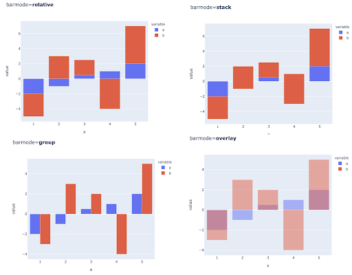
Comparing multiple values for multiple observations might also be done by placing multiple bars in each X-axis position, here are the main ways to do this:
Choice of color and color scales: An essential part of data visualization, and something that can communicate information extremely efficiently and intuitively if done right.
Categorical color scales: Useful for expressing categorical data. As the name suggests this is the type of data that shows which category a certain observation belongs to. In this case we want colors that are as distinct from one another as possible to show clear differences in categories (especially for visual elements that are displayed next to each other).
The following example uses a categorical color scale to show which system of government is implemented in each country. It’s quite easy to connect the colors of countries to the legend that shows which system of government is used. This is also called a choropleth map:
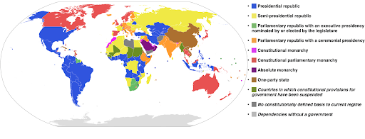
Source: Wikipedia
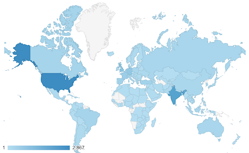
Sometimes the data that we want to visualize are for the same metric, and each country (or any other type of observation) falls on a certain point in a continuum ranging between the minimum and maximum points. In other words we want to visualize degrees of that metric.
In these cases we need to find a continuous (or sequential) color scale. It’s immediately clear in the following example which countries are more blue (and therefore get more traffic), and we can intuitively understand the nuanced differences between countries.
Your data might be continuous (like the traffic map chart above), yet the important thing about the numbers might be how much they diverge from a certain point. The diverging color scales are useful in this case.
The below chart shows net population growth rates. In this case, it’s interesting to know first whether or not a certain country has a positive or negative growth rate. Or, we want to know how far each country is from zero (and by how much). Glancing at the map immediately shows us which countries’ population is growing and which is shrinking. The legend also shows us that the maximum positive rate is 3.5% and that the maximum negative one is -0.5%. This also gives us an indication on the range of values (positive and negative).
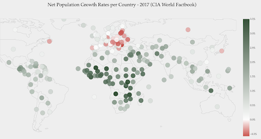
Source : Dashboardom.com
Unfortunately, the colors chosen for this scale are not ideal, because color-blind people might not be able to properly distinguish between red and green. This is a very important consideration when choosing our color scales.
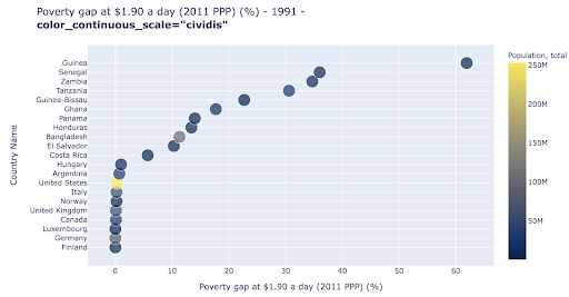
The scatter plot is one of the most widely used, and versatile plot types. The position of the dots (or any other marker) conveys the quantity we are trying to communicate. In addition to position, we can use several other visual attributes like color, size, and shape to communicate even more information. The following example shows the percentage of population living at $1.9/day, which we can clearly see as the horizontal distance of the points.
We can also add a new dimension to our chart by using color. This corresponds to visualizing a third column from the same data set, which in this case shows population data.
We can now see that the most extreme case in terms of population (USA), is very low on the poverty level metric. This adds richness to our charts. We could have also used size and shape to visualize even more columns from our data set. We need to strike a good balance between richness and readability though.
We might be interested in checking if there is a relationship between population and poverty levels, and so we can visualize the same data set in a slightly different way to see if such a relationship exists:
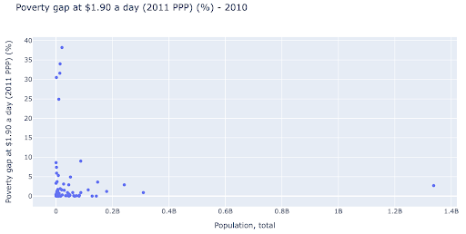
We have one outlier value in population at around 1.35B, and this means we have a lot of whitespace in the chart, which also means many values are squeezed in a very small area. We also have many overlapping dots, which makes it very difficult to spot any differences or trends.
The following chart contains the same information but visualized differently using two techniques:
- Logarithmic scale: We usually see data on an additive scale. In other words, every point on the axis (X or Y) represents an addition of a certain quantity of the data visualized. We can also have multiplicative scales, in which case for every new point on the X-axis we multiply (by ten in this example). This allows the points to be spread out and we need to think of multiples as opposed to additions, as we had in the previous chart.
- Using a different marker (larger empty circles): Selecting a different shape for our markers solved the issue of “over-plotting” where we might have several points on top of one another in the same location, which makes it very difficult to even see how many points we have.
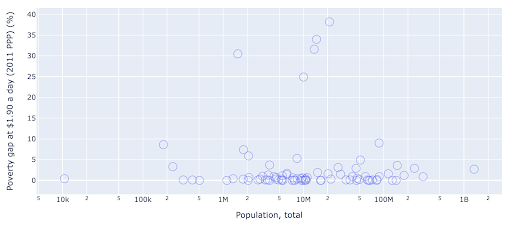
We can now see that there is a cluster of countries around the 10M mark, and other smaller clusters as well.
As I mentioned, there are many more types of chars and visualization options, and entire books written about the subject. I hope this gives you a few interesting thoughts to experiment with.
Model
We need to simplify our data, and find patterns, make predictions, or simply understand it better. This is another large topic, and can range from simply getting some summary statistics (average, median, standard deviation, etc), to visually modelling our data, using a model that summarizes or finds a trend, to using more complex techniques to get a mathematical formula for our data. We can also use machine learning to help us uncover more insights in our data.
Again, this is not a complete discussion of the topic, but I’d like to share a couple of examples where you might use some machine learning techniques to help you out.
In a crawl dataset, I was trying to learn a little more about the 404 pages, and if I can discover something about them. My first attempt was to check if there was a correlation between the size of the page and its status code, and there was – an almost perfect correlation!
I felt like a genius, for a few minutes, and quickly came back to planet Earth.
The 404 pages were all in a very tight range of page size that almost all pages with a certain number of kilobytes had a 404 status code. Then I realized that 404 pages by definition don’t have any content on them other than, well, “404 error page”! And that’s why they had the same size.
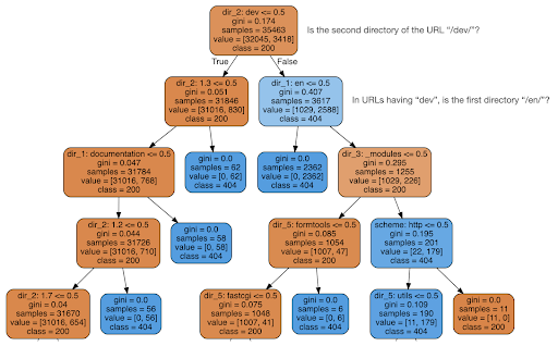
I then decided to check if the content could tell me something about the status code, so I split the URLs into their elements, and ran a decision tree classifier using sklearn. This is basically a technique that produces a decision tree, where following its rules could lead us to learning how to find our target, 404 pages in this case.
In the following decision tree, the first line in each box shows the rule to follow or check for, the “samples” line is the number of observations found in this box, and the “class” line tells us the class of the current observation, in this case, whether or not its status code is 200 or 404.
I won’t get into more details, and I know that the decision tree might not be clear if you’re not familiar with them, and you can explore the raw crawl dataset and analysis code if you are interested.
Basically what the decision tree found out was how to find almost all the 404 pages, using the directory structure of the URLs. As you can see, we found 3,617 URLs, simply by checking whether or not the second directory of the URL was “/dev/” (first light blue box in the second line from the top). So now we know how to locate our 404’s, and it seems that they are almost all in the “/dev/” section of the site. This definitely was a massive time saver. Imagine going manually through all possible URL structures and combinations to find this rule.
We still don’t have the full picture and why this is happening, and this can be pursued further, but at least we have now very easily located those URLs.
Another technique you might be interested in using is KMeans clustering, which groups data points into various groups/clusters. This is an “unsupervised learning” technique, where the algorithm helps us discover patterns we didn’t know existed.
Imagine you had a bunch of numbers, let’s say the population of countries, and you wanted to group them into two groups, large and small. How would you do that? Where would you draw the line?
This is different from getting the top ten countries, or the top X% of the countries. This would be very easy, we can sort the countries by population, and get the top X ones as we want.
What we want is to group them as “large” and “small” relative to this dataset, and assuming we don’t know anything about country populations.
This can be extended further into trying to cluster countries into three categories: small, medium, and large. This becomes much more difficult to do manually, if we want five, six, or more groups.
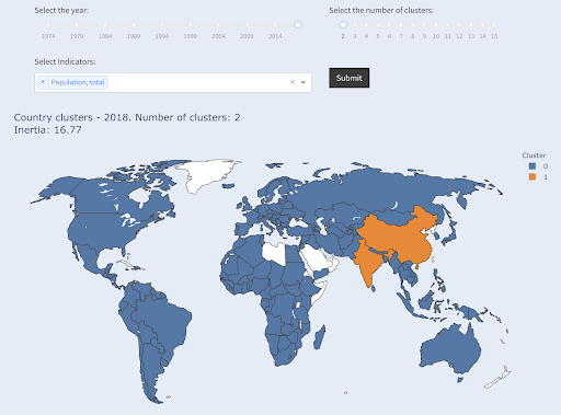
Note that we don’t know how many countries will end up in each group, since we are not asking for top X countries. Grouping into two clusters, we can see that we have only two countries in the large group: China and India. This makes intuitive sense, as these two countries have an average population that’s very far from all other countries. This group of countries has its own average and its countries are closer to one another than the countries of the other group:
Countries clustered into two groups by population
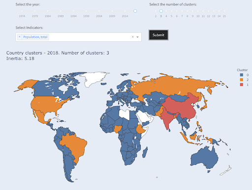
The third largest country in terms of population (USA ~330M) was grouped with all others, including countries that have a population of one million. That’s because 330M is much closer to 1M than 1.3 billion. Had we asked for three clusters, we would have gotten a different picture:
Countries clustered into three groups by population
And this is how countries would be clustered if we asked for four clusters:
Countries clustered into four groups by population
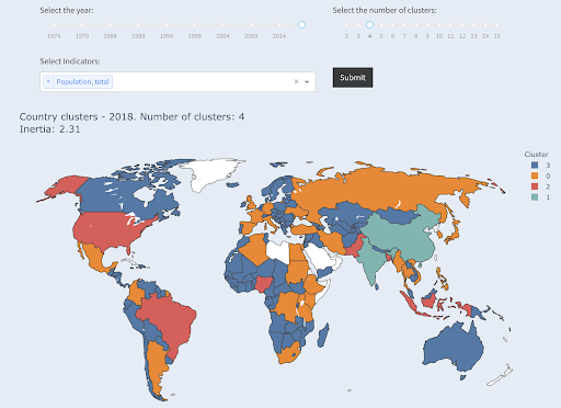
Source: povertydata.org (“Cluster Countries” tab)
This was clustering using only one dimension – population – in this case, and you can add more dimensions as well, and see where countries end up.
There are many other techniques and tools, and these were just a couple of examples that are hopefully interesting and practical.
Now we are ready to communicate our findings with our audience.
Communicate
After all the work we do in the previous steps, we need to eventually communicate our findings to other project stakeholders.
One of the most important tools in data science is the interactive notebook. Jupyter notebook is the most widely used, and supports pretty much all programming languages, and you might prefer to use RStudio’s special notebook format, which works the same way.
The main idea is to have data, code, narrative and visualizations in one place, so other people can audit them. It’s important to show how you got to those conclusions and recommendations for transparency, as well as reproducibility. Other people should be able to run the same code and get the same results.
Another important reason is the ability for others, including “future you”, to take the analysis further, and build upon the initial work you have done, improve it, and expand it in new ways.
Of course, this assumes that the audience is comfortable with code, and that they even care about it!
You also have the option to export your notebooks to HTML (and several other formats), excluding the code, so you end up with a user-friendly report, and yet retain the full code to reproduce the same analysis and results.
An important element of communication is data visualization, which was also briefly covered above.
Even better, is interactive data visualization, in which case you allow your audience to select values, and check out various combinations of charts and metrics to explore the data even further.
Here are some dashboards and data apps (some of them might take a few seconds to load) that I have created to give you some idea on what can be done.
Eventually, you can also create custom apps for your projects, in order to cater for special needs and requirements, and here is another set of SEO and marketing apps that might be interesting for you.
We went through the main steps in the Data Science cycle, and let’s now explore another benefit of “learning python”.
Python is for automation and productivity: true but incomplete
It seems to me that there is a belief that learning Python is mainly for getting productive and/or automating tasks.
This is absolutely true, and I don’t think we need to even discuss the value of being able to do something in a fraction of the time it would take us to do it manually.
The other missing part of the argument is data analysis. Good data analysis provides us with insights, and ideally we are able to provide actionable insights to guide our decision making process, based on our expertise and the data that we have.
A big part of what we do is to try to understand what is happening, analyze competition, figure out where the most valuable content is, decide what to do, and so on. We are consultants, advisors, and decision makers. Being able to get some insights from our data is clearly a big benefit, and the areas and skills mentioned here can help us achieve that.
What if you learned that your title tags have an average length of sixty characters, is this good?
What if you dig a little deeper and discover that half of your titles are way below sixty, while the other half have many more characters (making the average sixty)? In order to get practical and provide good recommendations, you need a higher-resolution view of your title tags’ lengths, probably a histogram that shows the frequency of your title tag lengths at each interval so you can have a separate strategy for length. A simple table would also do, for example:

Splitting title lengths by intervals of twenty was an arbitrary decision, and you can split them the way you want. Looking at the table above, and seeing that we have three times more than the average titles in the interval (0, 20), we might want to split it further to better understand what is going on.
Having a better view than the default single-statistic summaries that we get from standard tools, allows us to employ different strategies for different lengths. For example, we can remove the brand name from the titles that are longer than a certain number of characters, and keep it in other titles.
This was an example of very simple insights, which are possible due to the flexibility we get by using a programming language, and a set of data science tools. This also allows us to iterate and modify our approach, until we find a satisfactory point that can take our analysis to the next steps.
Visualization, machine learning, modeling and general data manipulation skills allow us to get better insights on our data, even though those analyses are typically done only once. Still, if you use code to get those insights, you can always take some parts and apply to other projects, or again to the same project. In this case, the insights we got, helped us in our automation, even more. The insights would tell us what needs to be automated and what doesn’t.
Should you learn Python?
Is a useless question, and the more useful one is, “How much Python (or R) should you learn?”
My view of how we use computers has evolved in the last few years.
I used to think that there were two main ways of using computers, either you are a regular user, using “point-and-click” applications to do certain tasks, or you are a developer who creates those applications that the rest of us use.
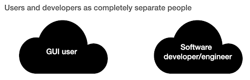
I then realized that it is more like a continuum between very high level use (pizza ordering approach), and the lower levels of the farm approach. I also realized that there is a happy sweet spot in between, where you learn enough programming to get productive and boost your data analysis skills, without having to become a software developer or engineer.
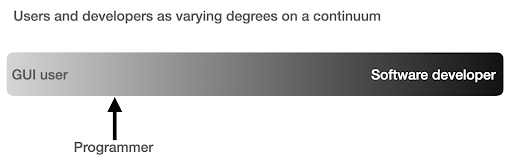
What are the main differences between being a programmer (a software user), and a software developer (or engineer)?
What are the differences between making a great coffee at home, versus establishing and running a cafe?
If making good coffee is one skill, then running a cafe requires ten other skills, most of which have nothing to do with making coffee.
You have to choose a good location (real estate), hire people (management and HR), manage cash flow and finances (accounting and finance), do marketing, legal, manage delivery, adhere to cleanliness and health standards, and so on. You can be a great coffee maker without knowing anything about those fields, but if you want to take it to the next level, you will have to manage all those additional tasks unrelated to making coffee.
The same applies to being a good programmer or data analyst versus being a software developer/engineer. There are so many other things that you have to know and worry about that you don’t need as a regular programmer doing stuff for yourself and co-workers and clients. Once you have enough knowledge and skills in programming and data science, you will be in a good position to choose and decide whether you want to continue as an analyst, focusing on data science, or if you want to end up creating software that other people would use.
How do I get into Data Science?
To learn anything I think you have to do two things in parallel:
- Learn the fundamentals and the theory properly: Taking courses and reading books, and getting into the fundamentals can push you forward, as you will be gaining in weeks, knowledge that took decades to establish. It would also immediately give you ideas on things you thought were impossible, or had no idea existed.
- Get as much real world exposure and experience as possible: Experience is always important, and my suggestion is to try as soon as you can to read_csv with Python or R, to actually do so with your GA, GSC, or crawl dataset. See what else you can do (visualize, manipulate, model, etc.). See if you get errors, try to analyze the data only using your programming language.
What does frustration look like, and by when will I get productive?
It’s difficult to say, and it depends on your skill, background, the hours you put in, but visualizing it like this might help you on those frustrating unproductive days:
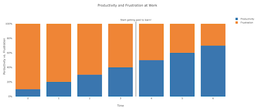
My suggestion is to take a non-trivial task, for example running an SEO audit for a site, only using Python. Your first session will mostly be frustrating, and most of the time will be spent checking documentation, and the definition of basic terms.
In parallel, you are still going through your course, and learning new stuff.
The value of that frustrating session is that it informs and motivates your theoretical learning. You will have questions in mind, and when you learn new things, you will immediately have a place to implement them.
Your next analysis session will probably be a little more productive, but still not productive enough to do at work. You go again to your learning and theory.
Do this enough times, and your time will become mostly productive, eventually you will be doing real work during working hours. The ideal scenario is where you are productive enough to do work, but every time use some time to research better techniques, which improves your work as well. By then you will start to get paid for learning, and your clients will be happily sponsoring you!
Suggested next steps
For the learning path a Data Science course would be great, especially if you get feedback on your work, and you can follow the topics in the order recommended.
If you go with Python I suggest the following libraries:
- pandas: The workhorse of all your tasks in preparing, cleaning, reshaping data whichever way you want. Fluency in pandas allows you to have full control over your data, which will help you immensely in visualization, general analysis, and machine learning
- Plotly and Dash: This is my favorite data visualization library, although there are many others. What I mostly like about it, is that it produces interactive and responsive HTML charts by default. It is very detailed and thorough in its options, yet simple to use. Plotly also includes Plotly Express, which is a high-level plotting tool, which is more intuitive to use, and takes a data-oriented approach (as opposed to a chart-oriented approach). Plotly also created Dash, which is the tool for creating interactive dashboards, but also serves as a full front-end web development framework. Other important data visualization libraries are matplotlib, altair, and bokeh, and for interactive data apps, there is panel and streamlit. Another important feature is that Plotly and Dash are available in all languages used in Data Science. You might use other libraries, and this is just my personal preference. Speaking of personal preferences:
- advertools: This is a library that I created to provide various online marketing tools, most importantly, an SEO crawler, log file parser and compressor, multi robots.txt parser, recursive sitemap parser, SEM keyword and text ad generator for large scale campaigns, weighted frequency word counter, Google SERP downloader, YouTube data API, and a few other tools. It is still evolving, and you are more than welcome to contribute any suggestions, bugs, or issues you might have with it.
These should be enough for beginners, and when you are familiar with them, you can do your own research for more specialized libraries, machine learning and deep learning tools, or libraries that are specialized in performance, or a special niche use-case.