
CTR curve, or in other words organic click through rate based on position, is data that shows you how many blue links on a Search Engine Result Page (SERP) obtain CTR based on their position. For example, most of the time, the first blue link in SERP gets the most CTR.
At the end of this tutorial, you will be able to calculate your site’s CTR curve based on it’s directories or calculate organic CTR based on CTR queries. The output of my Python code is an insightful box and bar plot that describes the site CTR curve.
If you are a beginner and don’t know the CTR definition, I will explain it more in the next section.
What is Organic CTR or Organic Click Through Rate?
CTR comes from dividing organic clicks into impressions. For example, if 100 people search for “apple” and 30 people click on the first result, the CTR of the first result is 30 / 100 * 100 = 30%.
This means that from every 100 searches, you get 30% of them. It is important to remember that the impressions in Google Search Console (GSC) are not based on the appearance of your website link in the searcher viewport. If the result appears on the searcher SERP, you get one impression for each of the searches.
What are the uses of the CTR curve?
One of the important topics in SEO is organic traffic predictions. To improve rankings in some set of keywords, we need to allocate thousands and thousands of dollars to get more shares. But the question at a company’s marketing level is often, “Is it cost efficient for us to allocate this budget?”.
Also, besides the topic of budget allocations for SEO projects, we need to get an estimate of our organic traffic increase or decrease in the future. For example, if we see one of our competitors trying hard to replace us in our SERP rank position, how much will this cost us?
In this situation or many other scenarios, we need our site’s CTR curve.
Why don’t we use CTR curve studies and use our data?
Simply answered, there isn’t any other website that has your site characteristics in SERP.
There is a lot of research for CTR curves in different industries and different SERP features, but when you have your data, why don’t your sites calculate CTR instead of relying on third-party sources?
Let’s start doing this.
Calculating the CTR curve with Python: Getting started
Before we dive into the calculation process of Google’s click through rate based on position, you need to know basic Python syntax and have a basic understanding of common Python libraries, like Pandas. This will help you to better understand the code and customize it in your way.
Additionally, for this process, I prefer to use a Jupyter notebook .
For calculating organic CTR based on position, we need to use these Python libraries:
- Pandas
- Plotly
- Kaleido
Also, we’ll use these Python standard libraries:
- os
- json
As I said, we will explore two different ways of calculating the CTR curve. Some steps are the same in both methods: importing the Python packages, creating a plot images output folder, and setting output plot sizes.
# Importing needed libraries for our process
import os
import json
import pandas as pd
import plotly.express as px
import plotly.io as pio
import kaleido
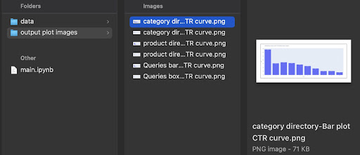
Here we create an output folder for saving our plot images.
# Creating plot images output folder
if not os.path.exists('./output plot images'):
    os.mkdir('./output plot images')
You can change the height and width of the output plot images below.
# Setting width and height of the output plot images
pio.kaleido.scope.default_height = 800
pio.kaleido.scope.default_width = 2000
Let’s begin with the first method that is based on queries CTR.
First method: Calculate CTR curve for an entire website or a specific URL property base on queries CTR
First of all, we need to get all of our queries with their CTR, average position, and impression. I prefer using one complete month of data from the past month.
In order to do this, I get queries data from the GSC site impression data source in Google Data Studio. Alternatively, you could acquire this data in any way you prefer, like GSC API or “Search Analytics for Sheets” Google Sheets add-on for example. This way, if your blog or product pages have a dedicated URL property, you can use them as a data source in GDS.
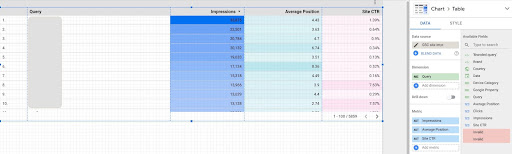
1. Getting queries data from Google Data Studio (GDS)
To do this:
- Create a report and add a table chart to it
- Add your site “Site impression” data source to the report
- Choose “query” for dimension as well as “ctr”, “average position” and”‘impression” for metric
- Filter out queries that contain the brand name by creating a filter (Queries containing brands will have a higher click-through rate, which will decrease the accuracy of our data)
- Right-click on the table and click on Export
- Save the output as CSV
2. Loading our data and labeling queries based on their position
For manipulating the downloaded CSV, we’ll use Pandas.
The best practice for our project’s folder structure is to have a ‘data’ folder in which we save all of our data.
Here, for the sake of fluidity in the tutorial, I didn’t do this.
query_df = pd.read_csv('./downloaded_data.csv')
Then we label our queries based on their position. I created a ‘for’ loop for labeling positions 1 to 10.
For example, if the average position of a query is 2.2 or 2.9, it will be labeled “2”. By manipulating the average position range, you can achieve the accuracy you desire.
for i in range(1, 11):
    query_df.loc[(query_df['Average Position'] >= i) & (
        query_df['Average Position'] < i + 1), 'position label'] = i
Now, we will group queries based on their position. This helps us to manipulate each position queries data in a better way in the next steps.
query_grouped_df = query_df.groupby(['position label'])
3. Filtering queries based on their data for CTR curve calculation
The easiest way to calculate the CTR curve is to use all queries data and make the calculation. However; don’t forget to think of those queries with one impression in position two in your data.
These queries, based on my experience, make a lot of difference in the final outcome. But the best way is to try it yourself. Based on the dataset, this may change.
Before we start this step, we need to create a list for our bar plot output and a DataFrame for storing our manipulated queries.
# Creating a DataFrame for storing 'query_df' manipulated data
modified_df = pd.DataFrame()

# A list for saving each position mean for our bar chart
mean_ctr_list = []
Then, we loop over query_grouped_df groups and append the top 20% queries based on the impressions to the modified_df DataFrame.
If calculating CTR only based on the top 20% of queries having the most impressions is not the best for you, you can change it.
To do so, you can increase or decrease it by manipulating .quantile(q=your_optimal_number, interpolation='lower')] and your_optimal_number must be between 0 to 1.
For example, if you want to get the top 30% of your queries, your_optimal_num is the difference between 1 and 0.3 (0.7).
for i in range(1, 11):
        # A try-except for handling those situations that a directory hasn't any data for some positions
        try:
            tmp_df = query_grouped_df.get_group(i)[query_grouped_df.get_group(i)['impressions'] >= query_grouped_df.get_group(i)['impressions']
                                                 .quantile(q=0.8, interpolation='lower')]
            mean_ctr_list.append(tmp_df['ctr'].mean())
            modified_df = modified_df.append(tmp_df, ignore_index=True)
        except KeyError:
            mean_ctr_list.append(0)

# Deleting 'tmp_df' DataFrame for reducing memory usage
del [tmp_df]
4. Drawing a box plot
This step is what we’ve been waiting for. To draw plots, we can use Matplotlib, seaborn as a wrapper for Matplotlib, or Plotly.
Personally, I think using Plotly is one of the best fits for marketers who love exploring data.
As compared to Mathplotlib, Plotly is so easy to use and with just a few lines of code, you can draw a beautiful plot.
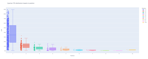
# 1. The box plot
box_fig = px.box(modified_df, x='position label', y='Site CTR', title='Queries CTR distribution based on position',
             points='all', color='position label', labels={'position label': 'Position', 'Site CTR': 'CTR'})

# Showing all ten x-axes ticks
box_fig.update_xaxes(tickvals=[i for i in range(1, 11)])

# Changing the y-axes tick format to percentage
box_fig.update_yaxes(tickformat=".0%")

# Saving plot to 'output plot images' directory
box_fig.write_image('./output plot images/Queries box plot CTR curve.png')
With only these four lines, you can get a beautiful box plot and start exploring your data.
If you want to interact with this column, in a new cell run:
box_fig.show()
Now, you have an attractive box plot in output that is interactive.
When you hover over an interactive plot in the output cell, the important number you are interested in is the “man” of each position.
This shows the mean CTR for each position. Because of the mean importance, as you remember, we create a list that contains each position’s mean. Next, we’ll move on to the next step to draw a bar plot based on each position’s mean.
5. Drawing a bar plot
Like a box plot, drawing the bar plot is so easy. You can change the title of charts by modifying the title argument of the px.bar().
# 2. The bar plot
bar_fig = px.bar(x=[pos for pos in range(1, 11)], y=mean_ctr_list, title='Queries mean CTR distribution based on position',
              labels={'x': 'Position', 'y': 'CTR'}, text_auto=True)

# Showing all ten x-axes ticks
bar_fig.update_xaxes(tickvals=[i for i in range(1, 11)])

# Changing the y-axes tick format to percentage
bar_fig.update_yaxes(tickformat='.0%')

# Saving plot to 'output plot images' directory
bar_fig.write_image('./output plot images/Queries bar plot CTR curve.png')
At the output, we get this plot:
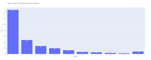
As with the box plot, you can interact with this plot by running bar_fig.show().
That’s it! With a few lines of code, we get the organic click through rate based on position with our queries data.
If you have a URL property for each of your subdomains or directories, you can get these URL properties queries and calculate the CTR curve for them.
[Case Study] Improving rankings, organic visits and sales with log files analysis

Second method: Calculating CTR curve based on landing pages URLs for each directory
In the first method, we calculated our organic CTR based on queries CTR, but with this approach, we obtain all of our landing pages data and then calculate the CTR curve for our selected directories.
I love this way. As you know, the CTR for our product pages is so different than that of our blog posts or other pages. Each directory has its own CTR based on position.
In a more advanced manner, you can categorize each directory page and get the Google organic click through rate based on position for a set of pages.
1. Getting landing pages data
Just like the first method, there are several ways to get Google Search Console (GSC) data. In this method, I preferred getting the landing pages data from GSC API explorer at: https://developers.google.com/webmaster-tools/v1/searchanalytics/query.
For what’s needed in this approach, GDS does not provide solid landing page data. Also, you can use the “Search Analytics for Sheets” Google Sheets add-on.
Note that the Google API Explorer is a good fit for those sites with less than 25K pages of data. For larger sites, you can get landing pages data partially and concatenate them together, write a Python script with a ‘for’ loop to get all of your data out of GSC, or use third-party tools.
To get data from Google API Explorer:
- Navigate to the “Search Analytics: query” GSC API documentation page: https://developers.google.com/webmaster-tools/v1/searchanalytics/query
- Use the API Explorer that is on the right-hand side of the page
- In the “siteUrl” field, insert your URL property address, like
https://www.example.com. Also, you can insert your domain property as followssc-domain:example.com - In the “request body” field add
startDateandendDate. I prefer to get last month’s data. The format of these values isYYYY-MM-DD - Add
dimensionand set its values topage - Create a “dimensionFilterGroups” and filter out queries with brand variation names (replacing
brand_variation_nameswith your brand names RegExp) - Add
rawLimitand set it to 25000 - At the end press the ‘EXECUTE’ button
You can also copy and paste the request body below:
{
  "startDate": "2022-01-01",
  "endDate": "2022-02-01",
  "dimensions": [
    "page"
  ],
  "dimensionFilterGroups": [
    {
      "filters": [
        {
          "dimension": "QUERY",
          "expression": "brand_variation_names",
          "operator": "EXCLUDING_REGEX"
        }
      ]
    }
  ],
  "rowLimit": 25000
}
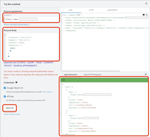
After the request is executed, we need to save it. Because of the response format, we need to create a JSON file, copy all of the JSON responses, and save it with the downloaded_data.json filename.
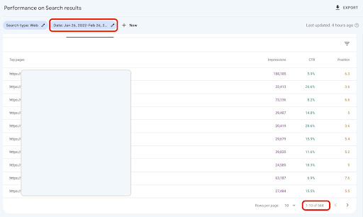
If your site is small, like a SASS company site, and your landing page data is under 1000 pages, you can easily set your date in GSC and export landing pages data for the “PAGES” tab as a CSV file.
2. Loading landing pages data
For the sake of this tutorial, I’ll assume you get data from Google API Explorer and save it in a JSON file. For loading this data we have to run the code below:
# Creating a DataFrame for the downloaded data
with open('./downloaded_data.json') as json_file:
    landings_data = json.loads(json_file.read())['rows']
    landings_df = pd.DataFrame(landings_data)
Additionally, we need to change a column name to give it more meaning and apply a function to get landing page URLs directly in the “landing page” column.
# Renaming 'keys' column to 'landing page' column and converting 'landing page' list to an URL
landings_df.rename(columns={'keys': 'landing page'}, inplace=True)
landings_df['landing page'] = landings_df['landing page'].apply(lambda x: x[0])
3. Getting all landing pages root directories
First of all, we need to define our site name.
# Defining your site name between quotes. For example, 'https://www.example.com/' or 'http://mydomain.com/'
site_name = ''
Then we run a function on landing page URLs to get their root directories and see them in output to choose them.
# Getting each landing page (URL) directory
landings_df['directory'] = landings_df['landing page'].str.extract(pat=f'((?<={site_name})[^/]+)')

# For getting all directories in the output, we need to manipulate Pandas options
pd.set_option("display.max_rows", None)

# Website directories
landings_df['directory'].value_counts()
Then, we choose for which directories we need to obtain their CTR curve.
Insert the directories into the important_directories variable.
For example, product,tag,product-category,mag. Separate directory values with comma.
important_directories = ''
important_directories = important_directories.split(',')
4. Labeling and grouping landing pages
Like queries, we also label landing pages based on their average position.
# Labeling landing pages position
for i in range(1, 11):
    landings_df.loc[(landings_df['position'] >= i) & (
        landings_df['position'] < i + 1), 'position label'] = i
Then, we group landing pages based on their “directory”.
# Grouping landing pages based on their 'directory' value
landings_grouped_df = landings_df.groupby(['directory'])
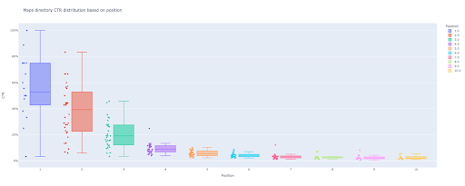
5. Generating box and bar plots for our directories
In the previous method, we didn’t use a function to generate the plots. However; for calculating the CTR curve for different landing pages automatically, we need to define a function.
# The function for creating and saving each directory charts
def each_dir_plot(dir_df, key):
# Grouping directory landing pages based on their 'position label' value
dir_grouped_df = dir_df.groupby(['position label'])
# Creating a DataFrame for storing 'dir_grouped_df' manipulated data
modified_df = pd.DataFrame()
# A list for saving each position mean for our bar chart
mean_ctr_list = []
'''
Looping over 'query_grouped_df' groups and appending the top 20% queries based on the impressions to the 'modified_df' DataFrame.
If calculating CTR only based on the top 20% of queries having the most impressions is not the best for you, you can change it.
For changing it, you can increase or decrease it by manipulating '.quantile(q=your_optimal_number, interpolation='lower')]'.
'you_optimal_number' must be between 0 to 1.
For example, if you want to get the top 30% of your queries, 'your_optimal_num' is the difference between 1 and 0.3 (0.7).
'''
for i in range(1, 11):
# A try-except for handling those situations that a directory hasn't any data for some positions
try:
tmp_df = dir_grouped_df.get_group(i)[dir_grouped_df.get_group(i)['impressions'] >= dir_grouped_df.get_group(i)['impressions']
.quantile(q=0.8, interpolation='lower')]
mean_ctr_list.append(tmp_df['ctr'].mean())
modified_df = modified_df.append(tmp_df, ignore_index=True)
except KeyError:
mean_ctr_list.append(0)
# 1. The box plot
box_fig = px.box(modified_df, x='position label', y='ctr', title=f'{key} directory CTR distribution based on position',
points='all', color='position label', labels={'position label': 'Position', 'ctr': 'CTR'})
# Showing all ten x-axes ticks
box_fig.update_xaxes(tickvals=[i for i in range(1, 11)])
# Changing the y-axes tick format to percentage
box_fig.update_yaxes(tickformat=".0%")
# Saving plot to 'output plot images' directory
box_fig.write_image(f'./output plot images/{key} directory-Box plot CTR curve.png')
# 2. The bar plot
bar_fig = px.bar(x=[pos for pos in range(1, 11)], y=mean_ctr_list, title=f'{key} directory mean CTR distribution based on position',
labels={'x': 'Position', 'y': 'CTR'}, text_auto=True)
# Showing all ten x-axes ticks
bar_fig.update_xaxes(tickvals=[i for i in range(1, 11)])
# Changing the y-axes tick format to percentage
bar_fig.update_yaxes(tickformat='.0%')
# Saving plot to 'output plot images' directory
bar_fig.write_image(f'./output plot images/{key} directory-Bar plot CTR curve.png')
After defining the above function, we need a ‘for’ loop to loop over the directories data for which we want to get their CTR curve.
# Looping over directories and executing the 'each_dir_plot' function
for key, item in landings_grouped_df:
    if key in important_directories:
        each_dir_plot(item, key)
In the output, we get our plots in the output plot images folder.
Advanced tip!
You can also calculate the different directories’ CTR curves by using the queries landing page. With a few changes in functions, you can group queries based on their landing pages directories.
You can use the request body below to make an API request in API Explorer (don’t forget the 25000 row limitation):
{
  "startDate": "2022-01-01",
  "endDate": "2022-02-01",
  "dimensions": [
    "query",
    "page"
  ],
  "dimensionFilterGroups": [
    {
      "filters": [
        {
          "dimension": "QUERY",
          "expression": "brand_variation_names",
          "operator": "EXCLUDING_REGEX"
        }
      ]
    }
  ],
  "rowLimit": 25000
}
Tips for customizing CTR curve calculating with Python
For getting more accurate data for calculating CTR curve, we need to use third-party tools.
For example, besides knowing which queries have a featured snippet, you can explore more SERP features. Also, if you use third-party tools, you can get the pair of queries with the landing page rank for that query, based on SERP features.
Then, labeling landing pages with their root (parent) directory, grouping queries based on directory values, considering SERP features, and finally grouping queries based on position. For CTR data, you can merge CTR values from GSC to their peer queries.