Google Search Console (GSC) is definitely one of the most useful tools for SEO Specialists, as it allows you to get information about index coverage and especially the queries you are currently ranking for. Knowing this, a lot of people analyze GSC data using spreadsheets and it is fine, as long as you understand that there is much more room for improvement with tools such as programming languages.
Unfortunately, GSC interface is pretty limited both in terms of rows displayed (just 5000) and available time period, only 16 months. It’s clear that this can severely limit your ability to get insights and it’s not suitable for bigger websites.
Python allows you to get GSC data with ease and automate more complex calculations that would take much more effort in traditional spreadsheet software.
This is the solution for one of the biggest problems in Excel, namely row limit and speed. Nowadays, you have way more alternatives to analyze data than before and that’s where Python comes into play.
You don’t need any advanced coding knowledge to follow this tutorial, just the understanding of some basic concepts and some practice with Google Colab.
Getting started with Google Search Console API
Before we get started, it is important to set up the Google Search Console API. The process is pretty simple, all you need is a Google account. The steps are as follows:
- Create a new project on Google Cloud Platform. You should have a Google account and I am quite sure you have one. Go to the console and then you should find an option at the top for creating a new project.
- Click on the menu on the left and select “API and services”, you will get to another screen.
- From the search bar at the top look for “Google Search Console API” and enable it.
- Then move on to the “Credentials” tab, you need some sort of permission to use the API.
- Configure the “consent” screen, as this is mandatory. It doesn’t matter for the use we are going to make whether it’s public or not.
- You can pick “Desktop App” for application type
- We will use OAuth 2.0 for this tutorial, you should download a json file and now you are done.
This is actually the hardest part for most people, especially who is not used to Google APIs. Don’t worry, the next steps will be much easier and less problematic.
Getting data from Google Search Console API with Python
My recommendation is that you use a notebook like Jupyter Notebook or Google Colab. The latter is better as you don’t have to worry about requirements. Therefore, what I am going to explain is based on Google Colab.
Before we start, update your json file to Google Colab with the following code:
from google.colab import files
files.upload()
Then, let’s install all the libraries we will need for our analysis and let’s make better table visualization with this code snippet:
%%capture
#load what is needed
!pip install git+https://github.com/joshcarty/google-searchconsole
import pandas as pd
import numpy as np
import matplotlib.pyplot as plt
from google.colab import data_table
!git clone https://github.com/jroakes/querycat.git
!pip install -r querycat/requirements_colab.txt
!pip install umap-learn
data_table.enable_dataframe_formatter() #for better table visualization
Finally, you can load the searchconsole library, which offers the easiest way to do so without relying on long functions. Run the following code with the arguments I am using and be sure that client_config has the same name of the uploaded json file.
import searchconsole
account = searchconsole.authenticate(client_config='client_secret_.json',serialize='credentials.json', flow='console')
You will be redirected to a Google page for authorizing the application, select your Google account and then copy and paste the code you will get into Google Colab bar.
We haven’t finished yet, you have to select the property for which you are going to need data. You can easily check your properties via account.webproperties to see what you should pick.
property_name = input('Insert the name of your website as listed in GSC: ')
webproperty=account[str(property_name)]
Once you are done, you are going to run a custom function to create an object containing our data.
def extract_gsc_data(webproperty, start, stop, *args):
 if webproperty is not None:
   print(f'Extracting data for {webproperty}')
   gsc_data = webproperty.query.range(start, stop).dimension(*args).get()
   return gsc_data
 else:
   print('Webproperty not found, please select the correct one')
   return None
The idea of the function is to take the property you defined before and a timeframe, in the form of start and end dates, along with dimensions.
The choice of being able to select dimensions is crucial for SEO Specialists because it allows you to understand whether you need a certain level of granularity. For instance, you may not be interested in getting the date dimension, in some cases.
My suggestion is to always pick query and page, as the Google Search Console interface can export them separately and it’s very annoying to merge them everytime. This is another benefit of the Search Console API.
In our case we can directly get the date dimension as well, to show some interesting scenarios where you need to take time into account.
ex = extract_gsc_data(webproperty, '2021-09-01', '2021-12-31', 'query', 'page', 'date')
Select a proper time frame, considering that for larger properties you will need to wait a lot of time. For this example, I am just considering a timespan of 3 months which is enough to get valuable insights from most datasets, on average.
You can select even one week if you are dealing with a huge quantity of data, what we care about is the process.
What I will show you here is either based on synthetic data or modified real data for the sake of being suitable for examples. As a consequence, what you see here is totally realistic and can reflect real-world scenarios.
Data cleaning
For those who don’t know, we cannot use our data as they are, there are some extra steps to ensure we are working correctly. First of all, we have to convert our object into a Pandas dataframe, a data structure you have to be familiar with as it is the basis of data analysis in Python.
df = pd.DataFrame(data=ex)
df.head()
The head method can show the first 5 rows of your dataset, it is very handy to have a glance of what your data look like. We can count how many pages we have by using a simple function.
A good way to remove duplicates is to convert an object into a set, because sets cannot contain duplicate elements.
Some of the code snippets were inspired by Hamlet Batista’s notebook and another one from Masaki Okazawa.
Removing branded terms
The very first thing to do is to remove branded keywords, we are looking for those queries not containing our branded terms. This is pretty straightforward to do with a custom function and you will usually have a set of branded terms.
For demonstrative purposes you don’t need to filter all of them out, but please do it for real analyses. It’s one of the most important data cleaning steps in SEO, otherwise you risk presenting misleading results.
domain_name = str(input('Insert brand terms separated by a comma: ')).replace(',', '|')
import re
domain_name = re.sub(r"\s+", "", domain_name)
print('Remove all spaces using RegEx:\n')
df['Brand/Non-branded'] = np.where(
   df['query'].str.contains(domain_name), 'Brand', 'Non-branded'
)
We are going to add a new column to our dataset to recognize the difference among the two classes. We can visualize via tables or barplots how much they account for the total number of queries.
I won’t show you the barplot as it’s very simple and I think a table is better for this case.
brand_count_df = df['Brand/Non-branded'].value_counts().rename_axis('cats').to_frame('counts')

brand_count_df['Percentage'] = brand_count_df['counts']/sum(brand_count_df['counts'])

pd.options.display.float_format = '{:.2%}'.format
brand_count_df
You can quickly see what is the ratio between brand and non-branded keywords to get an idea of how much you are going to remove from your dataset. There is no ideal ratio here, although you definitely want to have a higher percentage of non-branded keywords.
Then, we can just drop all the rows marked as branded and proceed with other steps.
#only select non-branded keywords
df = df.loc[df['Brand/Non-branded'] == 'Non-branded']
Filling missing values and other steps
If your dataset features missing values (or NAs in jargon) you have several options. The most common are either to drop them all or to fill them with a placeholder value like 0 or the mean of that column.
There is no correct answer and both approaches have their pros and cons, as well as risks. For Google Search Console data my best advice is to put a placeholder value like 0, to underestimate the effect of some metrics.
df.fillna(0, inplace = True)
Before we move on to actual data analysis, we need to adjust our features, namely the columns of our dataset. The position is especially of interest, as we want to use it for some cool pivot tables.
We can round the position to be an integer number, which serves our purpose.
df['position'] = df['position'].round(0).astype('int64')
You should follow all the other cleaning steps described above and then adjust the date column.
We are extracting months and years with the help of pandas. You don’t need to be this specific if working with a shorter time frame, this is an example that takes into account half a year.
#convert date to proper format
df['date'] = pd.to_datetime(df['date'])
#extract months
df['month'] = df['date'].dt.month
#extract years
df['year'] = df['date'].dt.year
[Ebook] Data SEO: The Next Big Adventure
Exploratory Data Analysis
The main advantage about Python is that you can do the same things you do in Excel but with many more options and easier. Let’s start with something every analyst knows really well: pivot tables.
Analyzing average CTR per position group
Analyzing Avg. CTR per position group is one of the most insightful activities as it allows you to understand the general situation of a website. Apply the pivot and then let’s plot it.
pd.options.display.float_format = '{:.2%}'.format
query_analysis = df.pivot_table(index=['position'], values=['ctr'], aggfunc=['mean'])
query_analysis.sort_values(by=['position'], ascending=True).head(10)

ax = query_analysis.head(10).plot(kind='bar')
ax.set_xlabel('Avg. Position')
ax.set_ylabel('CTR')
ax.set_title('CTR by avg. position')
ax.grid('on')
ax.get_legend().remove()
plt.xticks(rotation=0)
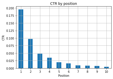
Figure 1: Representing CTR by position to spot anomalies.
The ideal scenario here is having a better CTR on the left side of the graph, as normally results in Position 1 should feature a much higher CTR. Be careful though, you may see some cases where the first 3 spots have a lower than expected CTR, and you have to investigate.
Please, consider edge cases as well, for instance those where position 11 is better than being first. As explained in Google documentation for Search Console, this metric doesn’t follow the order you may think at first.
Moreover, it adds that this metric is an average, as the position of the link changes every time and it’s impossible to have 100% accuracy.
Sometimes your pages rank high but are not convincing enough, so you could try fixing the title. Since this is a high level overview you are not going to see granular differences, so expect to act fast if this problem is at large scale.
Be also aware when a group of pages in lower positions have a higher average CTR than those at better spots.
For this reason you may want to extend your analysis up to position 15 or more, to spot strange patterns.
Query count per position and measuring SEO efforts
An increase in queries you are ranking for is always a good signal, yet it doesn’t necessarily mean better rankings in the future. Query count is the process of counting the number of queries you are ranking for and is one of the most important tasks that you can do with GSC data.
Pivot tables are a huge help once again, and we can plot the results.
ranking_queries = df.pivot_table(index=['position'], values=['query'], aggfunc=['count'])
ranking_queries.sort_values(by=['position']).head(10)
What you want as a SEO Specialist is to have a higher query count on the leftmost side, the top spots. The reason is quite natural, high positions get better CTR on average, which can translate to more people clicking on your page.
ax = ranking_queries.head(10).plot(kind='bar')
ax.set_ylabel('Count of queries')
ax.set_xlabel('Position')
ax.set_title('Ranking distribution')
ax.grid('on')
ax.get_legend().remove()
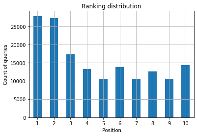
Figure 2: How many queries do I have by position?
What you care about is increasing the query count in the top positions as time goes by.
Playing with the date dimension
Let’s see how clicks vary in a consider interval of time, let’s get the sum of clicks first:
clicks_sum = df.groupby('date')['clicks'].sum()
We are grouping data by the date dimension and getting the sum of clicks for each of them, it’s a type of summarization.
We are now ready to plot what we got, the code is going to be pretty long just to improve the visualization, don’t be scared by it.
# Sum of clicks across period

%config InlineBackend.figure_format = 'retina'
from matplotlib.pyplot import figure

figure(figsize=(8, 6), dpi=80)
ax = clicks_sum.plot(color='red')
ax.grid('on')
ax.set_ylabel('Sum of clicks')
ax.set_xlabel('Month')
ax.set_title('How clicks varied on a monthly basis')

xlab = ax.xaxis.get_label()
ylab = ax.yaxis.get_label()

xlab.set_style('italic')
xlab.set_size(10)
ylab.set_style('italic')
ylab.set_size(10)

ttl = ax.title
ttl.set_weight('bold')

ax.spines['right'].set_color((.8,.8,.8))
ax.spines['top'].set_color((.8,.8,.8))

ax.yaxis.set_label_coords(-.15, .50)
ax.fill_between(clicks_sum.index, clicks_sum.values, facecolor='yellow')
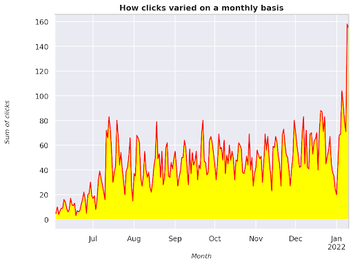
Figure 3: Plotting the sum of clicks in relation to the month variable
This is an example starting from June 2021 and going straight to half January 2022. All of the lines you are seeing above have the role of making this visualization prettier, you can try playing with it to see what happens.
Query count per position, monthly snapshot
Another cool visualization that we can plot in Python is the heatmap, which is even more visual than a simple barplot. I am going to show you how to display query count over time and according to its position.
import seaborn as sns
sns.set_theme()

df_new = df.loc[(df['position'] <= 10) & (df['year'] != 2022),:]

# Load the example flights dataset and convert to long-form
df_heat = df_new.pivot_table(index = "position", columns = "month", values = "query", aggfunc='count')

# Draw a heatmap with the numeric values in each cell
f, ax = plt.subplots(figsize=(20, 12))

x_axis_labels = ["September", "October", "November", "December"]

sns.heatmap(df_heat, annot=True, linewidths=.5, ax=ax, fmt='g', cmap = sns.cm.rocket_r, xticklabels=x_axis_labels)
ax.set(xlabel = 'Month', ylabel='Position', title = 'How query count per position changes with time')
#rotate Position labels to make them more readable
plt.yticks(rotation=0)
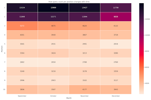
Figure 4: Heatmap showing the progress of query count according to position and month.
This is one of my favorite, heatmaps can be quite effective to display pivot tables, such as in this example. The period spans over 4 months and if you read it horizontally you can see how query count changes as time goes by. For position 10 you have a little increase from September to December, but for position 2 you have a striking decrease, as shown by the purple color.
In the following scenario you have the majority of queries in top spots which can be strikingly unusual. If that happens you may want to go back and analyze the dataframe, looking for possible branded terms, if any.
As you see from the code it’s not that hard to make complex plots, as long as you get the logic behind.
Query count should increase with time if you are doing the “right” things and we can plot the difference across two different timeframes. In the example I provided it’s clearly not the case, as, especially for top positions, where you are supposed to have a higher CTR.
Introducing some basic NLP concepts
Natural Language Processing (NLP) is a godsend for SEO and you don’t need to be an expert to apply the basic algorithms. N-grams are one of the most powerful but simple ideas that can get you insights with GSC data.
N-grams are contiguous sequences of letters, syllables or words. For our analysis words will be the unit of measure. An n-gram is called bigram when the adjacent elements are two (a pair) and trigram if they are three, and so on. I suggest you to test with different combinations and to go up to 5-grams at most.
In this way, you are able to spot the most common sentences in your competitors pages or to assess your own. Since Google may rely on phrase-based indexing it’s better to optimize for sentences rather than individual keywords, as shown by Google patents involving this topic.
As stated in the page above by Bill Slawski himself, the value of understanding related terms is of great value for optimization and for your users.
The nltk library is very famous for NLP applications and grants us the possibility to remove stop words in a given language, like English. Think of them as noise that you want to remove, in fact, articles and very frequent words don’t add any value in understanding a text.
import nltk

nltk.download('stopwords')
from nltk.corpus import stopwords
stoplist = stopwords.words('english')

from sklearn.feature_extraction.text import CountVectorizer
c_vec = CountVectorizer(stop_words=stoplist, ngram_range=(2,3))
# matrix of ngrams
ngrams = c_vec.fit_transform(df['query'])
# count frequency of ngrams
count_values = ngrams.toarray().sum(axis=0)
# list of ngrams
vocab = c_vec.vocabulary_
df_ngram = pd.DataFrame(sorted([(count_values[i],k) for k,i in vocab.items()], reverse=True)
           ).rename(columns={0: 'frequency', 1:'bigram/trigram'})

df_ngram.head(20).style.background_gradient()
We take the query column and count the frequency of bi-grams to create a dataframe storing bi-grams and their number of occurrences.
This step is actually very important to analyze competitors’ websites too. You can just scrape their text and check what are the most common n-grams, by tuning the n each time to see if you spot different patterns across high-ranking pages.
If you think about that for a second it makes much more sense, as an individual keyword doesn’t tell you anything about the context.
Low-hanging fruits
One of the most lovely things to do is to check low-hanging fruits, those pages that you can improve easily to see good results as early as possible. This is crucial in the first steps of every SEO project to convince your stakeholders. Therefore, if there is an opportunity to leverage such pages, just do it!
Our criteria to consider a page as such are quantiles for impressions and CTR. In other words, we are filtering rows that sit in the top 80% of impressions but are in the 20% that receive the lowest CTR. These rows will have a worse CTR than 80% of the rest.
top_impressions = df[df['impressions'] >= df['impressions'].quantile(0.8)]
(top_impressions[top_impressions['ctr'] <= top_impressions['ctr'].quantile(0.2)].sort_values('impressions', ascending = False))
Now you have a list with all the opportunities sorted by Impressions, in descending order.
You can think of other criteria to define what is a low-hanging fruit, according to your website needs and its size.
For smaller websites you may consider looking for higher percentages, whereas in large websites you should already get plenty of information with the criteria I am using.
[Ebook] Technical SEO for non-technical thinkers
Introducing querycat: classification and associations
Querycat is a simple yet powerful library that features association rule mining for clustering keywords and much more. I will only show you the associations as they are more valuable in this type of analysis.
You can learn more about this awesome library by having a look at querycat GitHub repository.
Short intro about association rule learning
Association rule learning is a method to find rules that define associations and co-occurrences across sets of items. This is slightly different from another unsupervised machine learning method, the so-called clustering.
The end goal is the same though, getting clusters of keywords to understand how our website is doing for some topics.
Querycat gives you the possibility to choose between two algorithms: Apriori and FP-Growth. We are going to choose the latter for better performances, so you can ignore the former.
FP-Growth is an improved version of Apriori to find frequent patterns in data sets. Association rule learning is very useful for e-commerce transactions as well, you may be interested in understanding what people buy together, for instance.
In this case our focus is all on queries, but the other application I mentioned can be another useful idea for Google Analytics data.
Explaining these algorithms from a data structure perspective is pretty challenging and in my opinion not necessary for your SEO tasks. I will just explain some basic concepts to understand what the parameters mean.
The 3 main elements of the 2 algorithms are:
- Support – It expresses the popularity of an item or an itemset. In technical words, it’s the number of transactions where query X and query Y appear together divided by the total number of transactions.
Moreover, it can be used as the threshold to remove infrequent items. Very useful for increasing statistical significance and performance. Setting a good minimum support is very good. - Confidence – you can think of it as the probability of co-occurrence for terms.
- Lift – The ratio between the support for (term 1 and term 2) and the support of term 1. We can look at its value to get insights into the relationship between terms. If larger than 1 the terms are correlated; if less than 1 the terms are unlikely to have an association: if lift is exactly 1 (or close) there is no significant relationship.
Further details are provided in this article about querycat written by the author of the library.
Now we are ready to move on to the practical part.
import querycat
query_cat = querycat.Categorize(df, 'query', min_support=10, alg='fpgrowth')

dfgrouped = df.groupby('category').agg(sumclicks = ('clicks', 'sum')).sort_values('sumclicks', ascending=False)
#create group to filter categories with less than 15 clicks (arbitrary number)
filtergroup = dfgrouped[dfgrouped['sumclicks'] > 15]
filtergroup

#apply filter
df = df.merge(filtergroup, on=['category','category'], how='inner')
We have filtered less frequent categories in the process, I picked 15 as a benchmark in my case. It’s just an arbitrary number, there is no criterion behind it.
Let’s check our categories with the following snippet:
df['category'].value_counts()
What about the 10 most clicked categories? Let’s check how many queries we have for each of them.
df.groupby('category').sum()['clicks'].sort_values(ascending=False).head(10)
The number to choose is arbitrary, be sure to pick one that filters out a good percentage of groups. One potential idea is to get the median of the impressions and drop the lowest 50%, provided that you want to exclude small groups.
Getting clusters and what to do with the output
My recommendation is to export your new dataframe to avoid running FP-Growth again, please do it to save useful time.
As soon as you have clusters you want to know clicks and impressions for each of them in order to assess which areas need the most improvements.
grouped_df = df.groupby('category')[['clicks', 'impressions']].agg('sum')
With some data manipulation we are able to improve our association results and have clicks and impressions for each cluster.
group_ex = df.groupby(['category'])['query'].apply(' | '.join).reset_index()
#remove duplicate queries and then sort them alphabetically
group_ex['query'] = group_ex['query'].apply(lambda x: ' | '.join(sorted(list(set(x.split('|'))))))

df_final = group_ex.merge(grouped_df, on=['category', 'category'], how='inner')
df_final.head()
You now have a CSV file with all your keyword clusters along with clicks and impressions.
#save csv file and download it to your local machine. If you use Safari, please consider switching to Chrome for downloading these files as it may not work.
df_final.to_csv('clusters_queries.csv')
files.download('clusters_queries.csv')
Actually, there are better methods for clustering, this is just an example on how you can use querycat to perform multiple tasks for an immediate use. The main goal here is to get as many insights as possible, especially for new websites where you don’t have that much knowledge.
Right now the best approaches involve semantics, so if you want to focus on clustering I suggest you consider learning graphs or embeddings.
However, these are advanced topics if you are a novice and you can simply try some pre-built Streamlit apps available online.
Conclusion and what’s next
Python can offer a major help in analyzing your website and can help you combine data cleaning, visualization and analysis in a single place. Extracting data from GSC API is definitely needed for more advanced tasks and is a “gentle” introduction to data automation.
While you can do a lot of more advanced calculations with Python, my recommendation is to check what makes sense in terms of SEO value.
For example, the Query Count is way more important as a whole in the long run, as you want your website to be considered for more queries.
Using notebooks is a big help for packing code with comments and this is the main reason why I suggest you get used to Google Colab.
This is just the beginning of what data analysis can offer to you, as the best ideas come from merging different datasets.
Google Search Console is per se a powerful tool and it’s totally free, the amount of practical information you can get from it is almost unlimited in the good hands.
